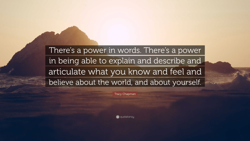
Words are powerful as they represent many things – emotions, subjects and thoughts. Through just one word, endless meanings and interpretations can unfold.
Dictionary definition of the word, “word”:
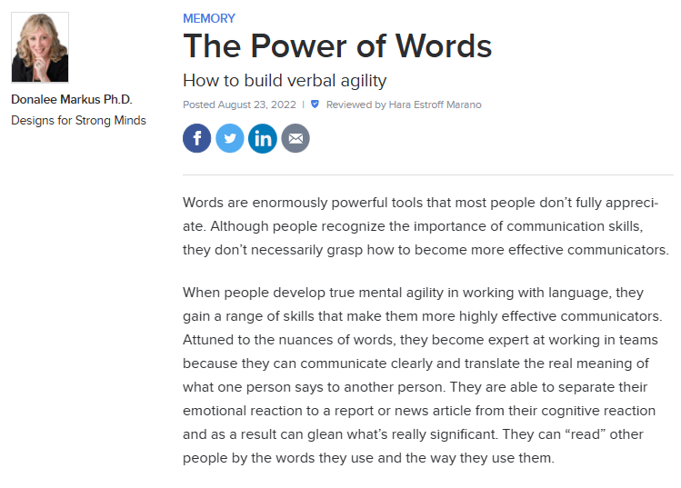
Research on the Power of Words:
From this article, I have learnt that we forget the importance of words. For example, being mean to someone can have a detrimental affect on one’s mental health and that is down to the power of the bully’s words. Or, for example, the main reason that world leaders become powerful is down to the way they communicate with words.
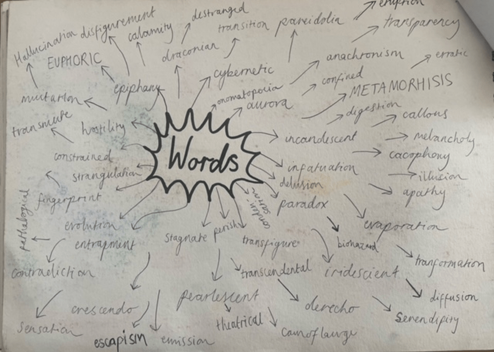
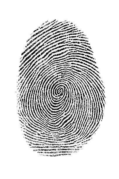
Fingerprint – an impression or mark made on a surface by a person’s fingertip, able to be used for identifying individuals from the unique pattern of whorls and lines on the fingertips.
Disfigure – spoil the appearance of.
Cybernetic – the science of communications and automatic control systems in both machines and living things.
Metamorphosis – a change of the form or nature of a thing or person into a completely different one.
Eruption – an act or instance of erupting.
Reflection – 1. the image of something in a mirror or on any reflective surface. 2. the return of light, heat, sound, or energy from a surface. 3. serious and careful thought.
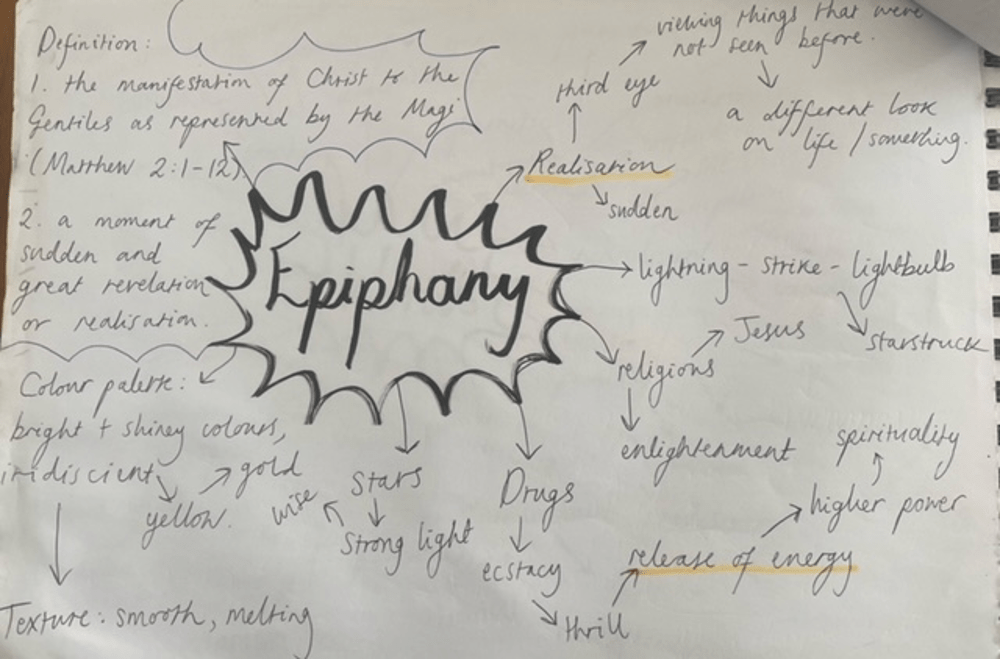
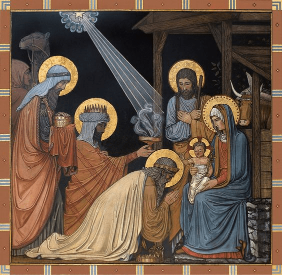
Epiphany – 1. the manifestation of Christ to the Gentiles as represented by the Magi (Matthew 2:1–12). 2. a moment of sudden and great revelation or realization.
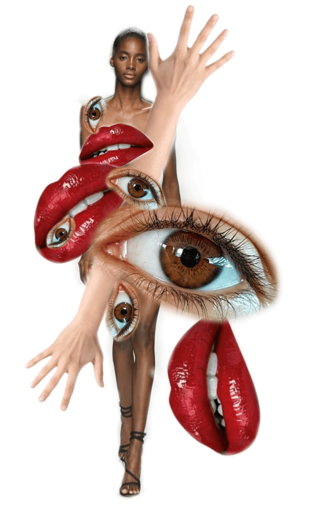
Chosen word…
CYBERNETIC
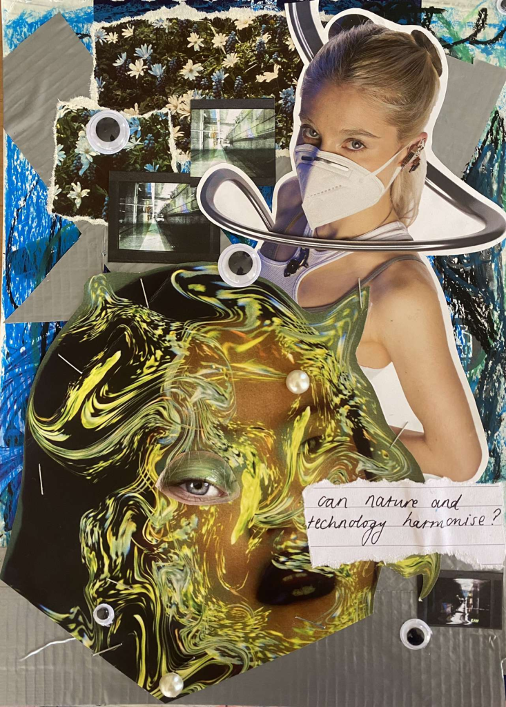
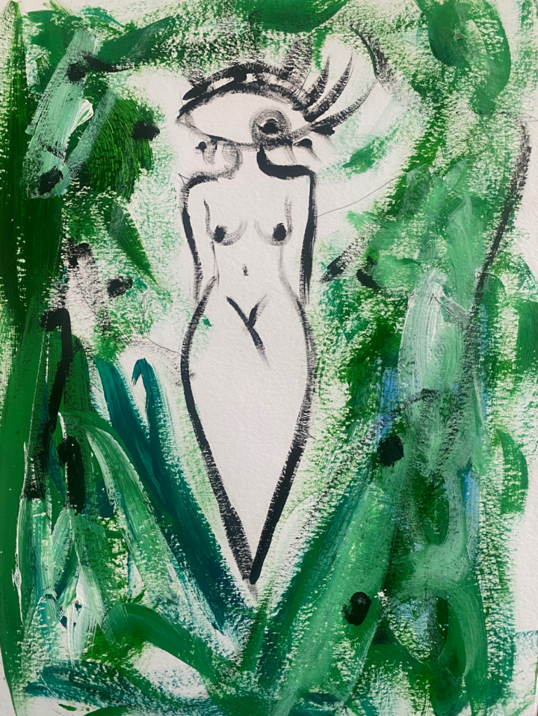
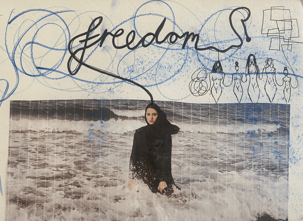
Out of all the words, I am mostly drawn to the word “cybernetic”, as it relates to modern world and I have an interest in the combination of the natural world and the man made. Can nature and technology come together to create an even greater force or can opposites not fuse?
^(a collage that I created which depicts the fuse of technology and nature)
Technology:
Technology is a modern invention that has created a whole new world – it has enabled us to evolve as human beings through intelligence and life expectancy.
The invention has both pros and cons. A pro being we can easily find where to go on Google Maps without having to spend hours staring at a map, or can easily call for help when we are desperately in need. The list continues…
However, there are cons to technology, one being the fact that it can make us lazy staring at our phone screens for hours on end or how technology provides us with deadlier weapons that can end the lives of billions of people.
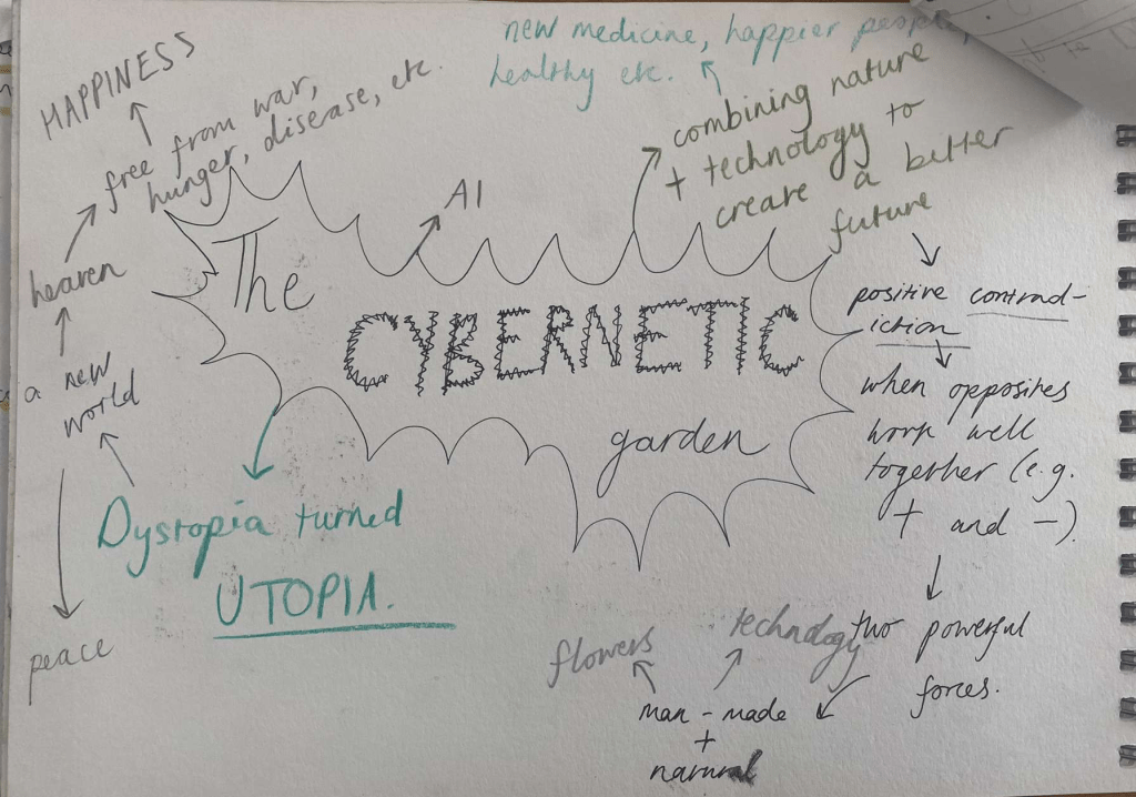
Word mind map –
Nature:
The natural world has been around longer than technology and is not made by man. It includes picturesque landscapes and fascinating creatures but also has power in its dramatic weather (floods, earthquakes, etc.). We cannot control nature which is what makes it greater than us. If you believe in God, God creates nature suggesting that it is a higher level of consciousness that controls it – vastly more powerful than any human.
It is an incredible wonder that inspires us all. It underpins our economy, our society, indeed our very existence. Our forests, rivers, oceans and soils provide us with the food we eat, the air we breathe, the water we irrigate our crops with. We also rely on them for numerous other goods and services we depend on for our health, happiness and prosperity.
It is our home and in this modern world it is easy to forget about nature due to technology’s existence, but what if nature and technology could become allies?
Word mind map –
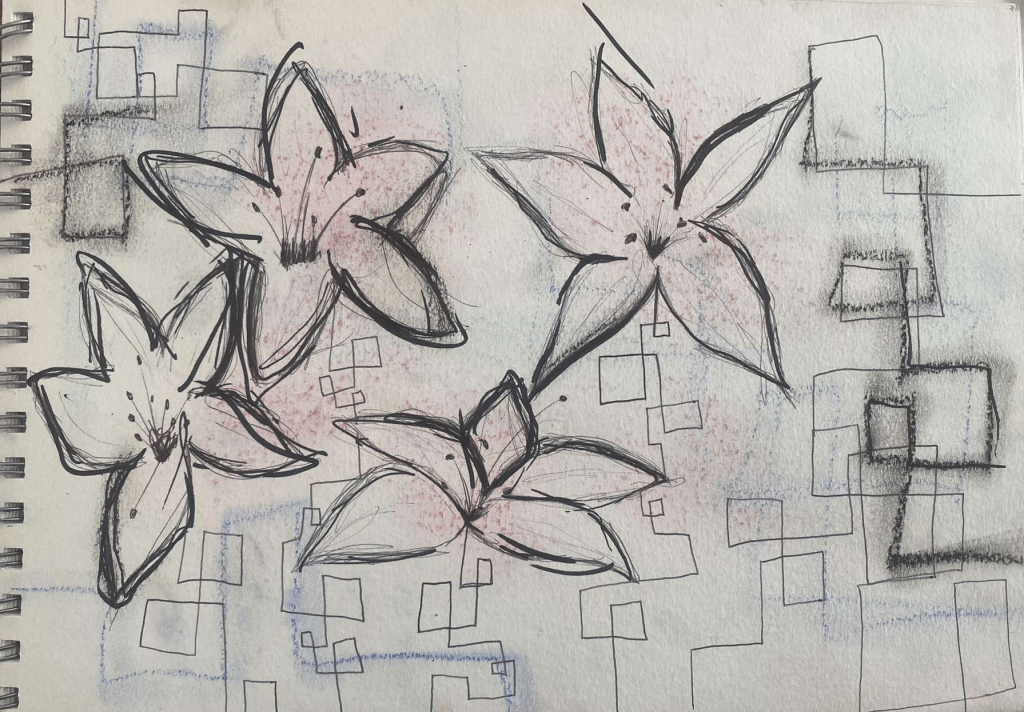
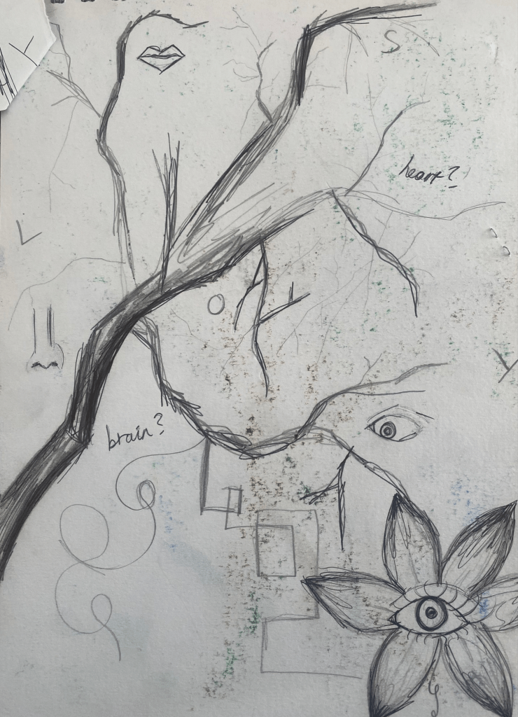
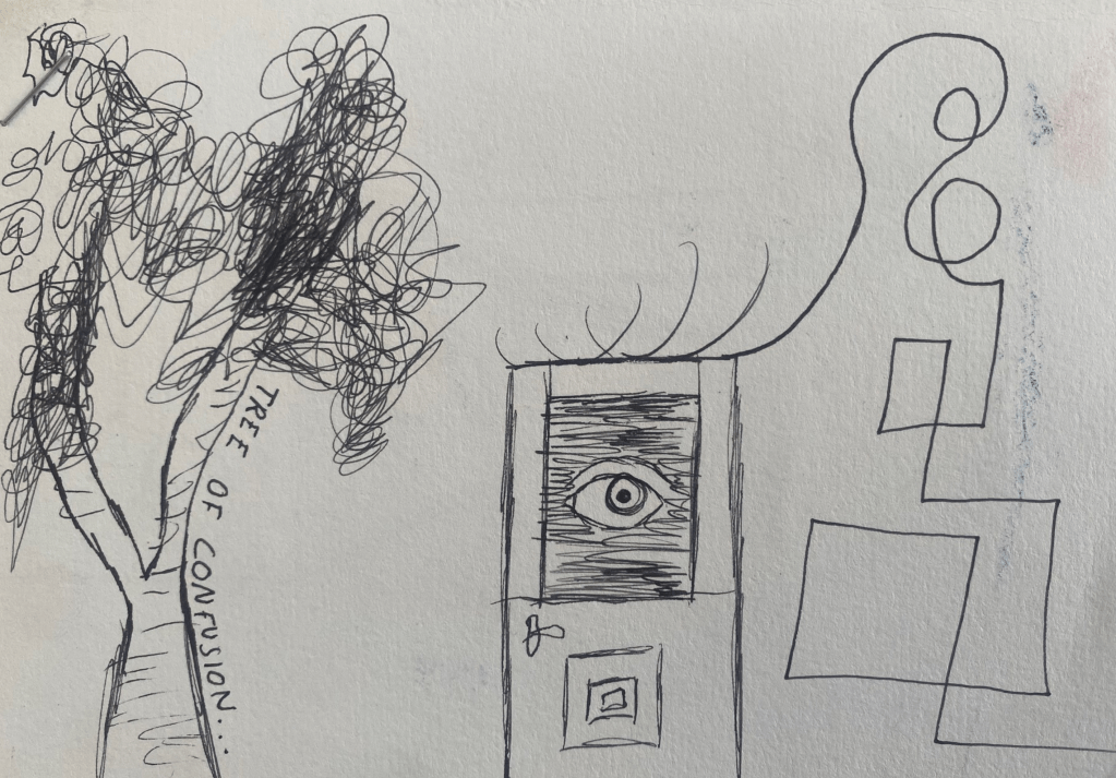
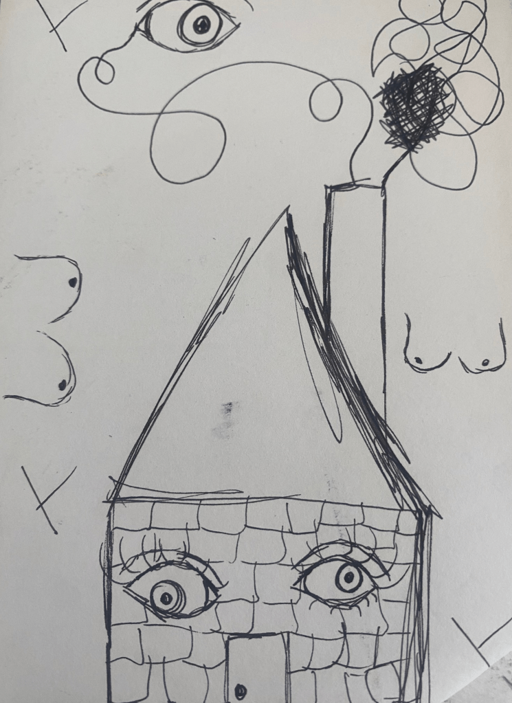
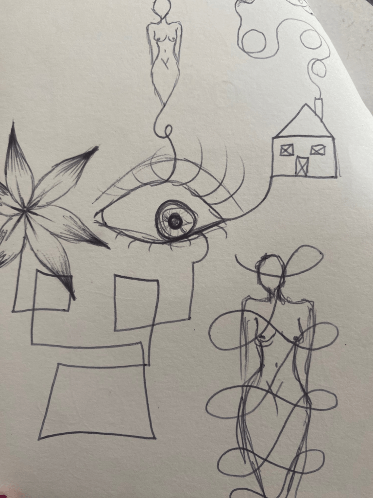
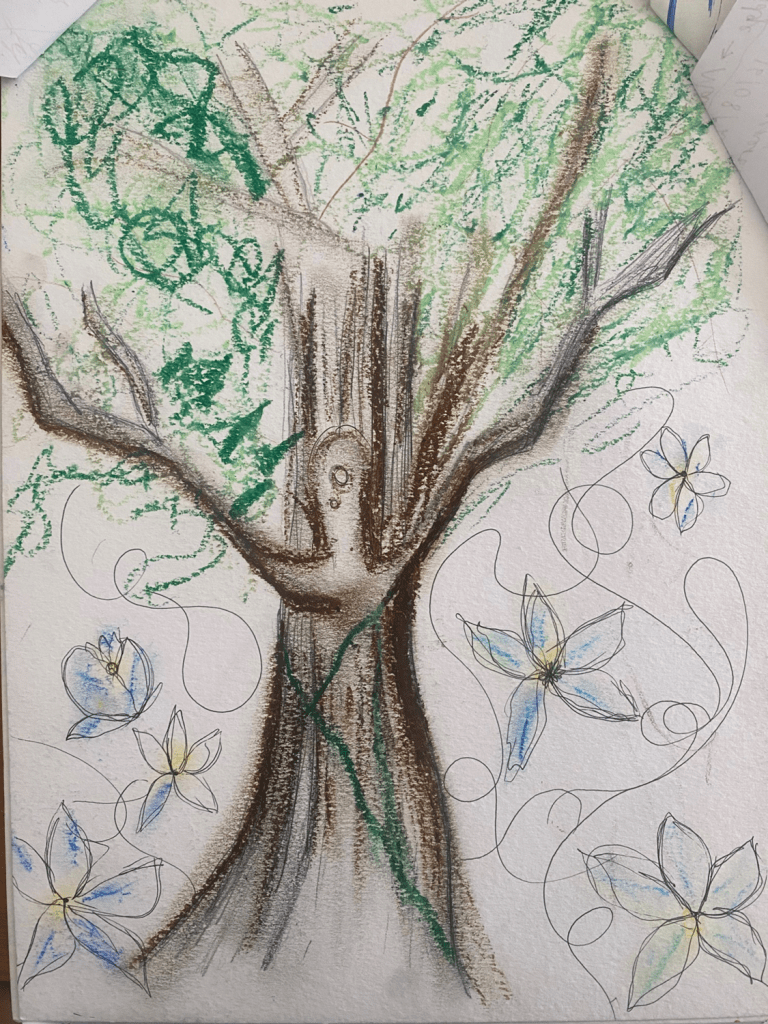
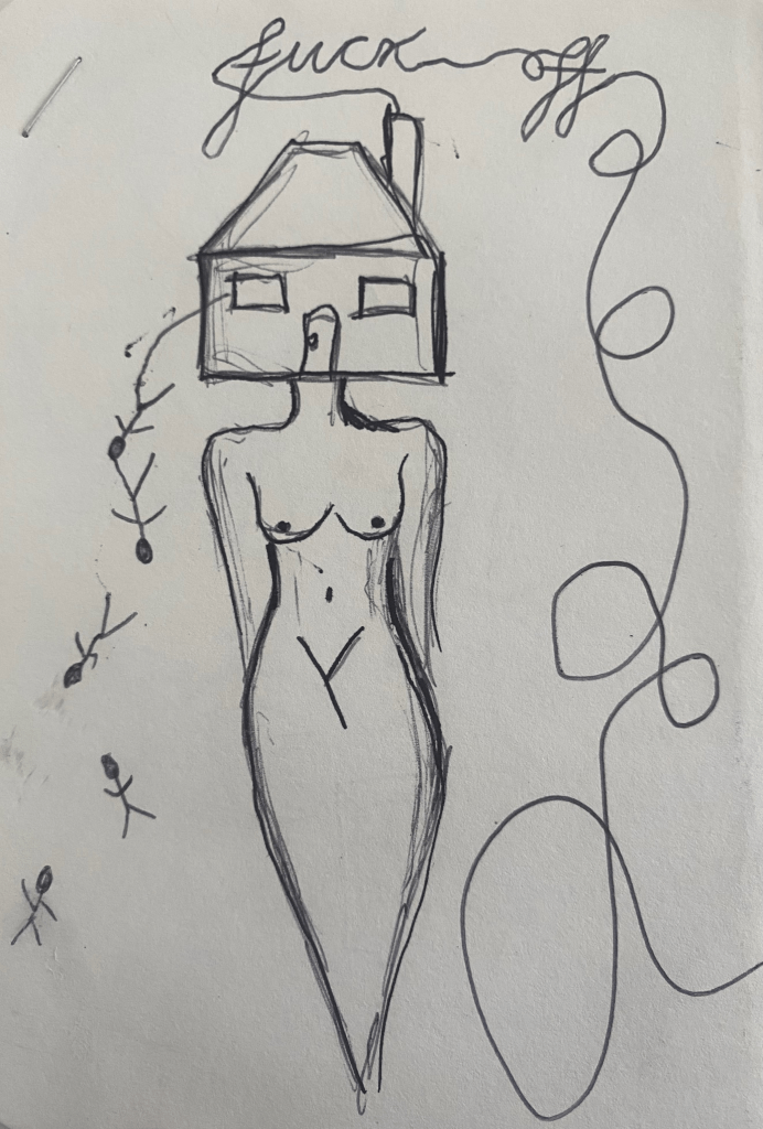
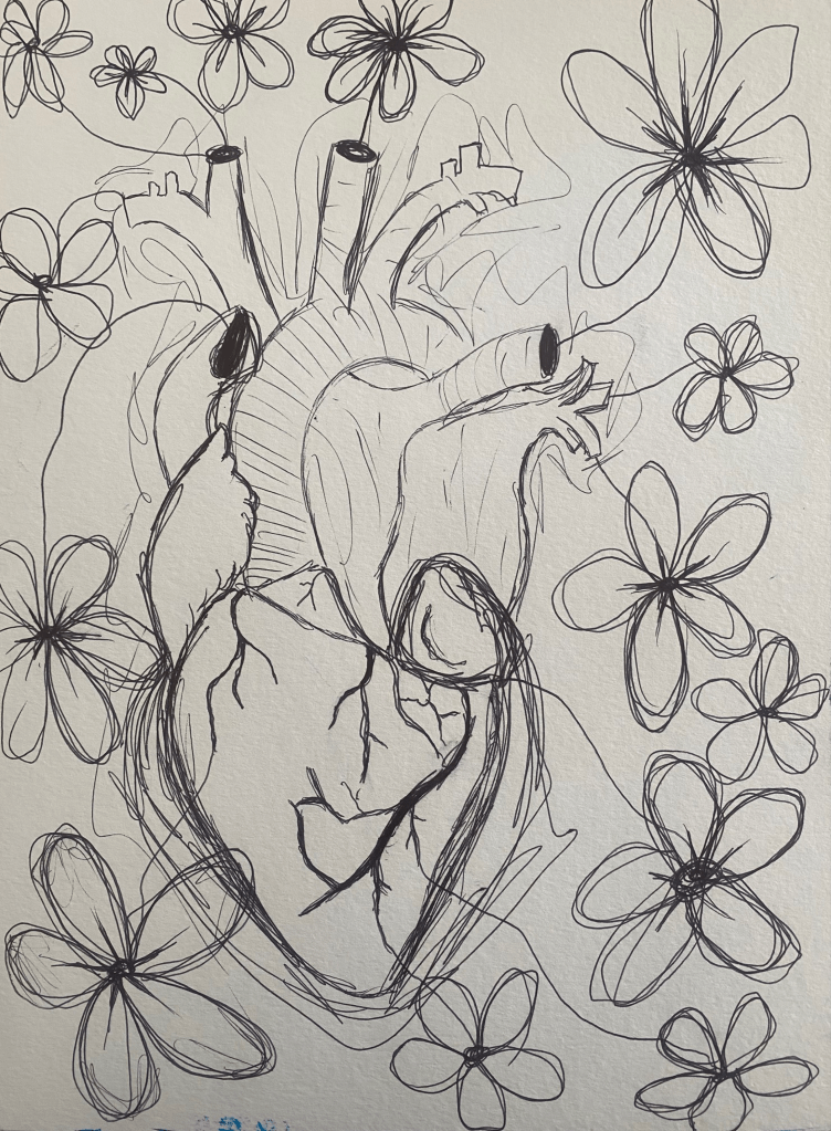
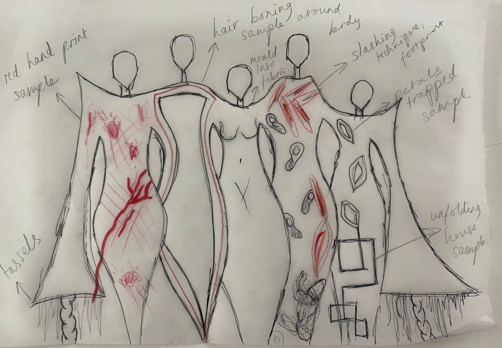
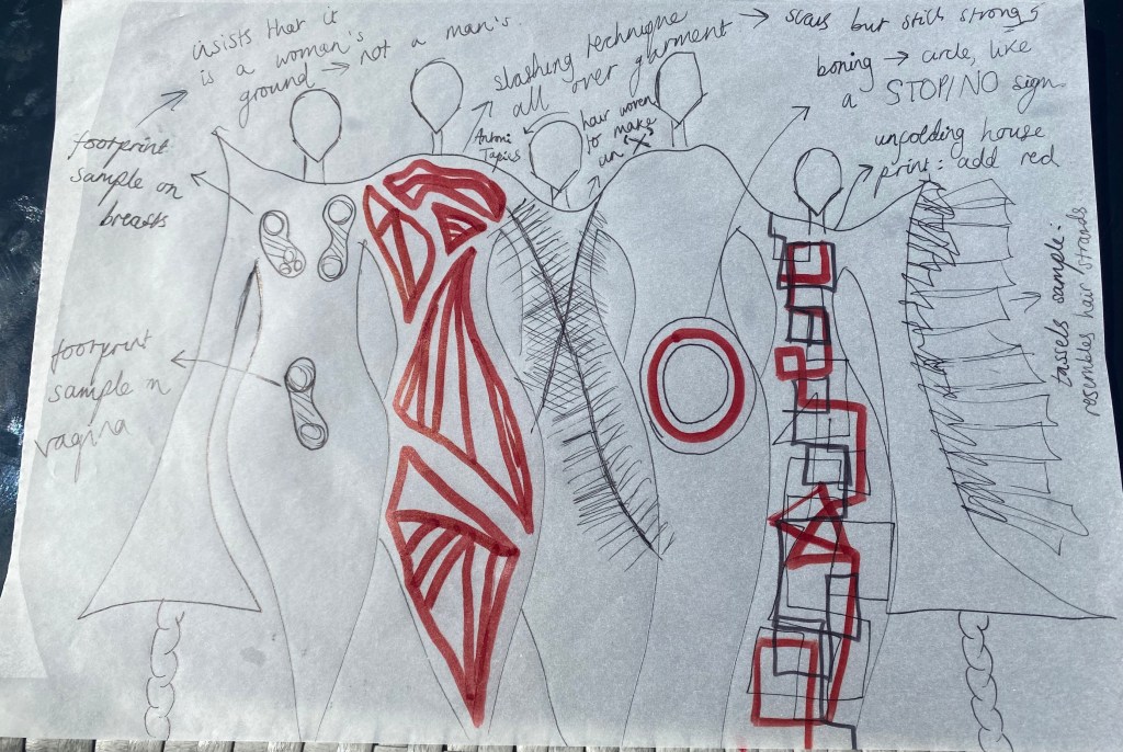
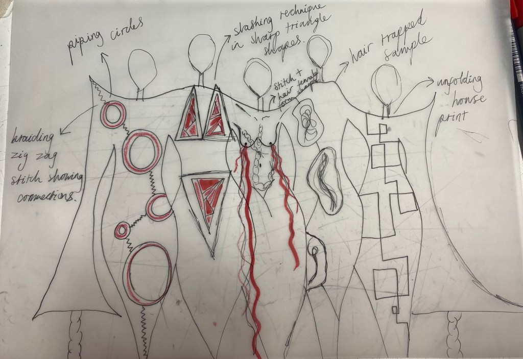
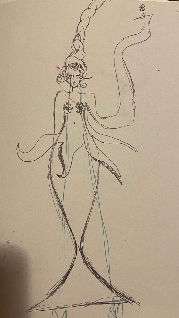
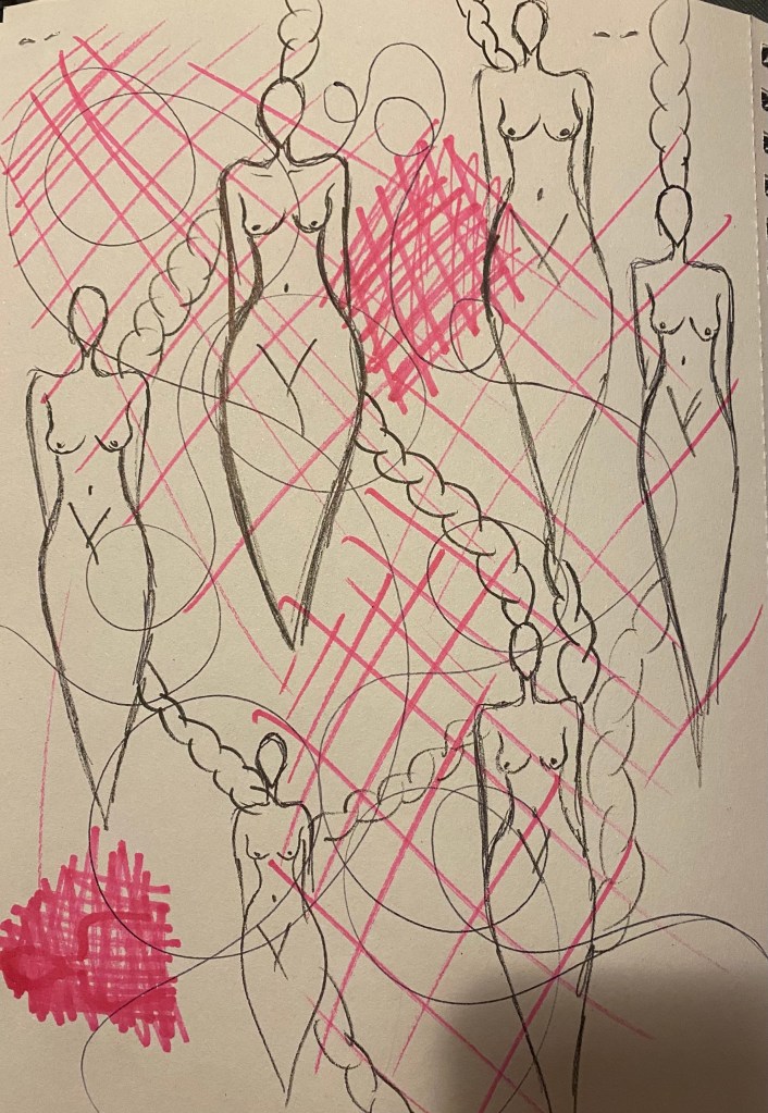
Sketches to get ideas flowing:
After this small piece of research on nature and technology, I decided to stop and sketch down ideas:
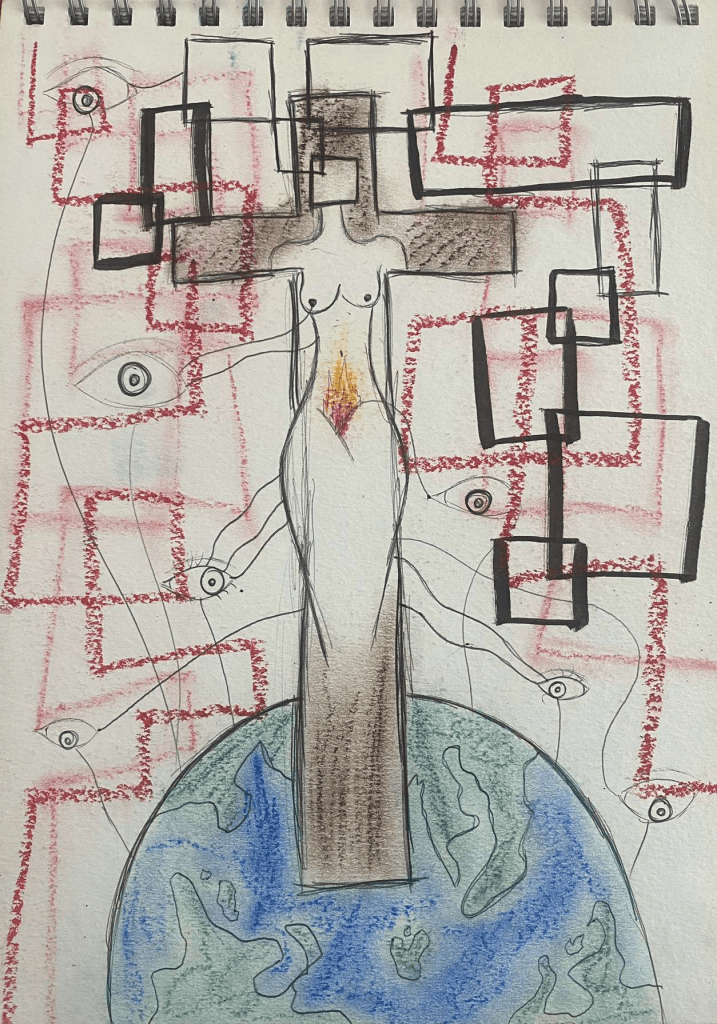
WOman Crucified
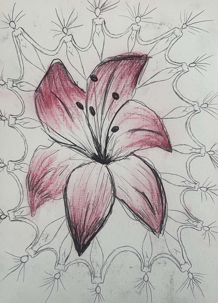
Union of Women
Cybernetic Garden
Entangled and Vulnerable
Force of Nature
Different Worlds
Branches of Feelings
A Strand of Hair + an Unfolding House = Her Freedom
Eye See U
Beautiful Chaos
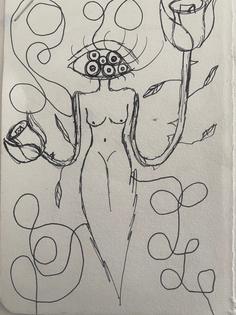
TREE OF CONFUSION
DON’T LET THE HOUSE GET YOU!!!
WOman SPIDER.2
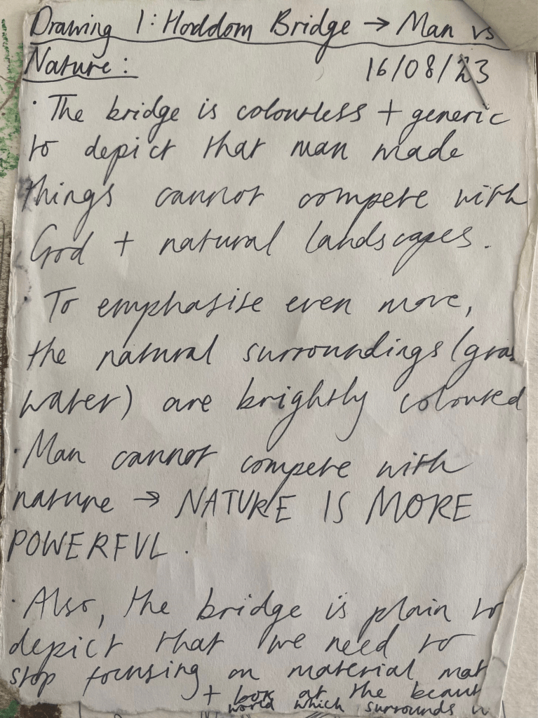
Man Vs. Nature
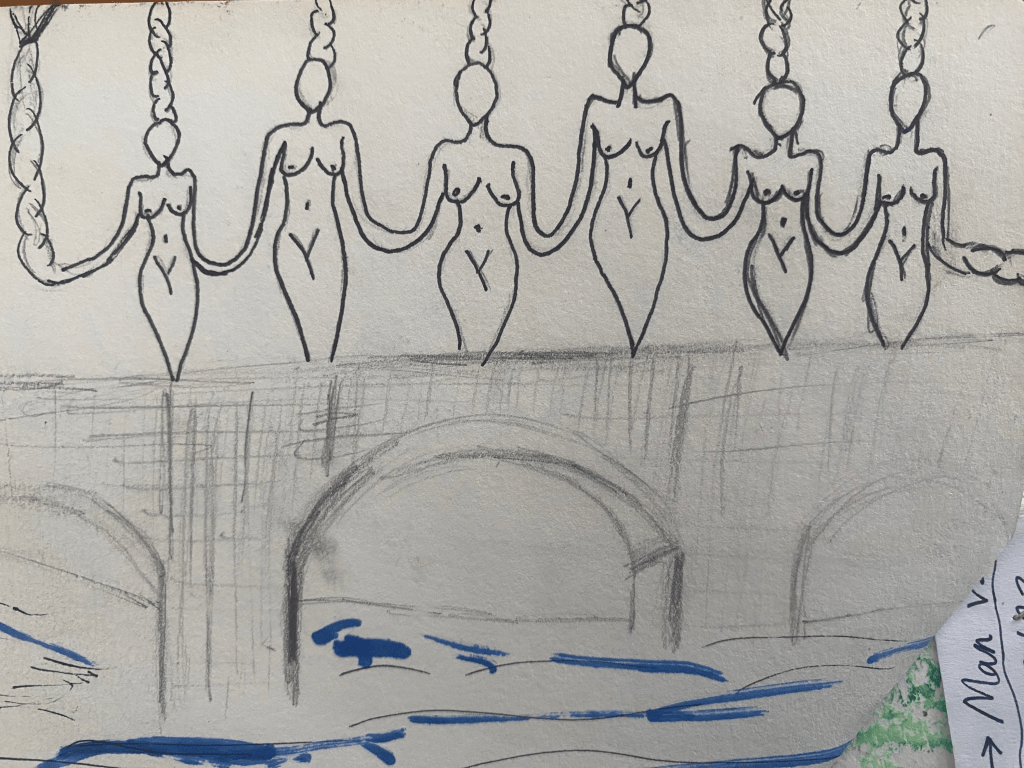
Woman Bridge
Branching for Freedom
Identity
Sharp Like a Thorn, Soft Like a Flower
Life, She
fVck off
She Eats Men, They Linger In Her Stomach Like Parasites
Sisterhood
Green Eyed Monster
Flower Bomb
Goodbye Society
Colourful Chaos of the WOman
Beware of the Spiders
Powerful Tree WOmen
Summary:
From doing these sketches and initial pieces of research, I noticed a recurring theme and was inspired to fuse technology and nature as one to create a powerful army of women in a world that oppresses them. Women will use both technology and nature as their mighty weapon, along with unity amongst themselves. This project will be a continued piece from my last project, therefore I won’t repeat the same research but take and add to it.
Plan:
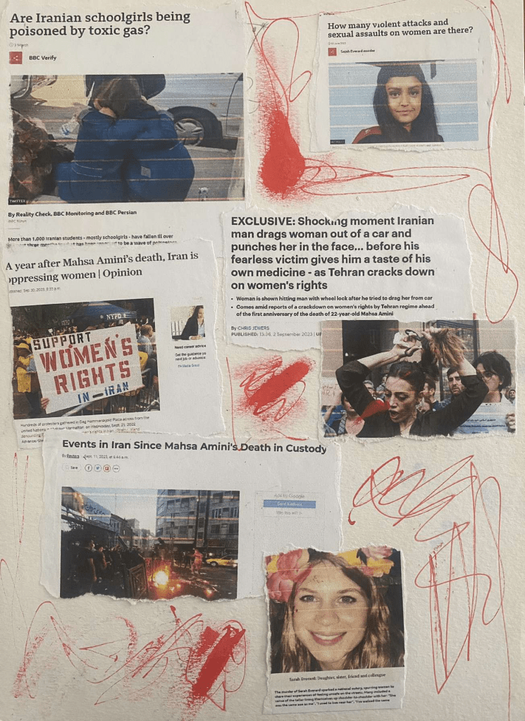
I will pay attention to injustices against women all over the world and reinvent their stories.
Also, taking inspiration from my last brief “Crown and Glory”, that focused on creating a powerful union of women, in defence against the injustices imposed on them in Iran, I will focus on Iran.
Therefore, I intend to create a ‘Cybernetic WOman Garden’:
Mood board:
Key Words:
Unity – by connecting and coming together as one, a greater, more powerful force is created.
Power – women will regain and channel their inner power that people try to knock down and convince them they don’t have.
Control – to regain control over their own lives and what they want to achieve. Not control in the way that men in power do (Hitler, Putin, Trump, etc.), but to take control over themselves and not allow other people to control them.
Connection – women have a connection that is different to the connection that women and men share. They understand what it is like to be a woman. Therefore, relating to the connections in nature and technology, I wish to show the connection in women.
Fuse – fuse is an electrical word.
Electric – a powerful force including lightning or wires, etc. It is striking and extremely dangerous like the women I wish to create.
Eerie – the army of women will be feared.
Summary of mood board: ethereal and dreamy colours yet a powerful and distinctive look.
Collages to get ideas flowing:
Reinvention
Technology Freaks
She Is Everywhere, She IS.
Home
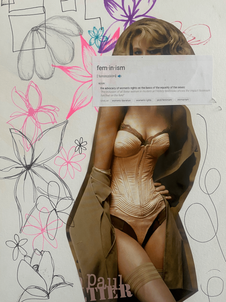
Feminism
Fierce Female Figures
WOman SPIDER
She Is Time
Bloody and Broken Fighter
freedom?
Omnipotent
Artists/Designers I am inspired by...
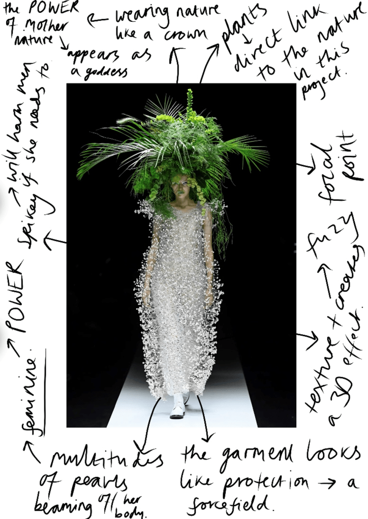
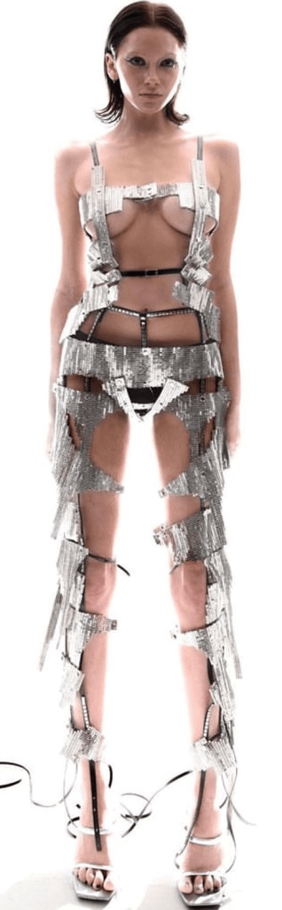
Noir Kei Ninomiya pays close attention to architectural shapes that challenge the idea of wearability in fashion. His work is always very large in size – “It’s easier to convey feelings in bigger pieces.” – Noir Kei Ninomiya, I am inspired by this statement as I believe that fashion should take up space, be loud and outstanding. Representing nature along with futuristic tones, I am immensely drawn to this as this is what my project is about – connecting two powerful forces: nature and technology, to create a mighty army of women. Therefore, the way that this designer can convert a human to a goddess is something that I intend to recreate. Beautiful yet strange.
Look 1:
Look 2:
Look 3:
Look 4:
Jean Paul Gaultier is known for his vision of the female form and how he replicates it to create a remarkable, and defying feminist world. She is transformed into a greater version of herself, and rather than giving her a masculine physique (as this is what is considered strength and dominance), he enhances her female form, making her powerfully and irrevocably feminine. It is her womanhood that is her superpower.
Look 1:
Look 2:
Look 3:
Zehu Crystal Wu envisions a new cultural phenomenon in society that redefines modern art by implementing the value and depth of fine art and technology in a fashionable way. She aspires to make modern art wearable, touchable, and communicative to everyone. Focusing on print, her garments create illusions which is something I am inspired by.
Look 1:
Look 2:
Look 3:
add fine artists, sculpture, fashion, photography, etc.
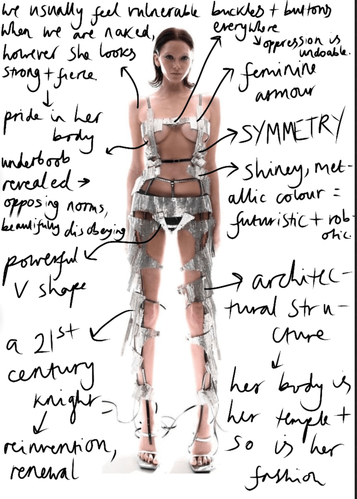
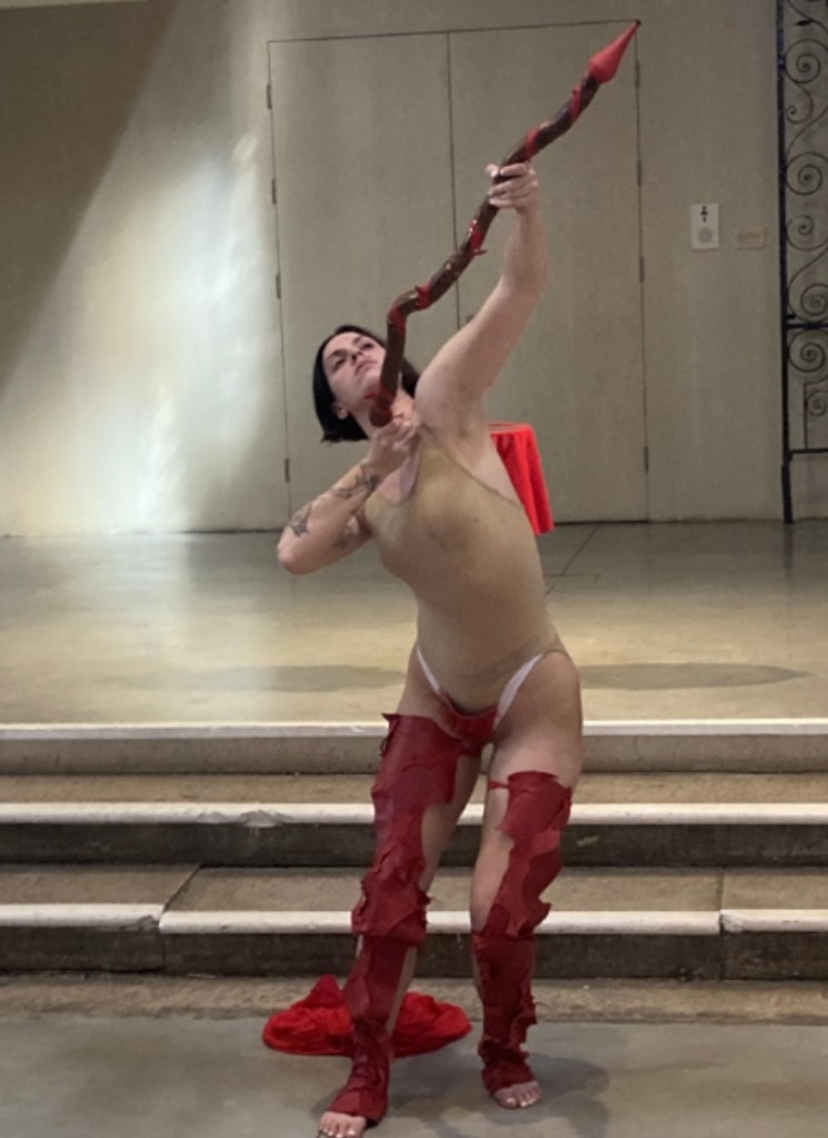
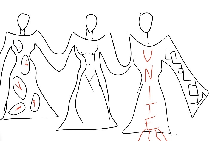
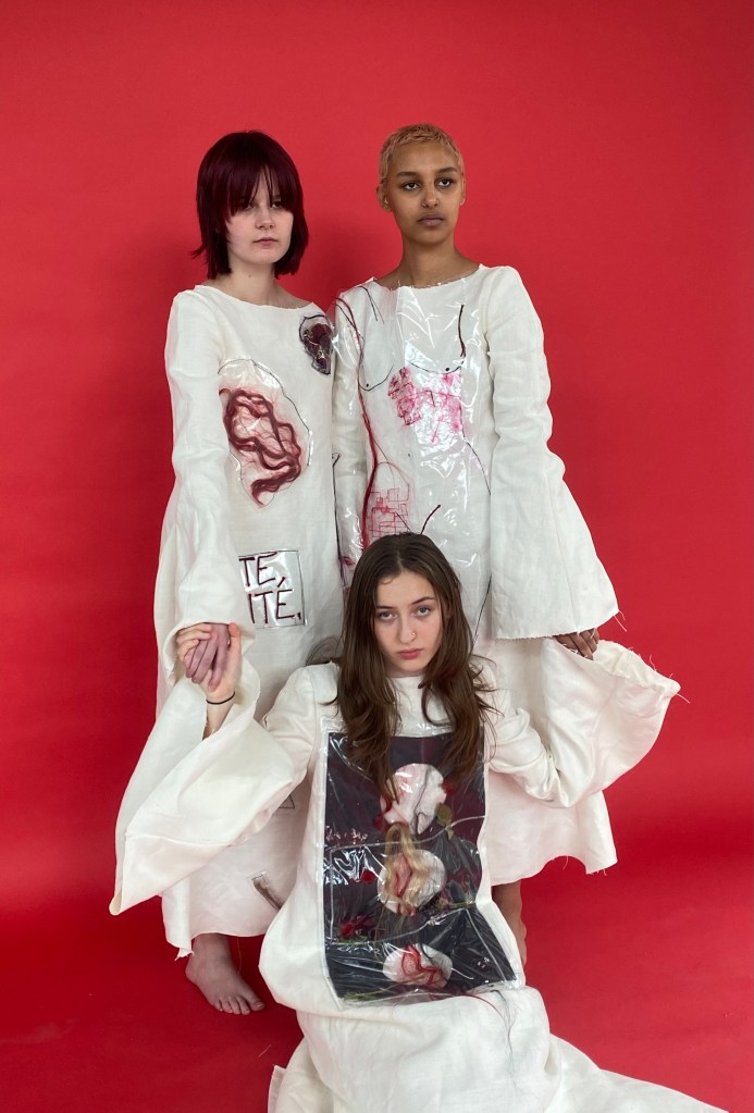
The aim of this project is to show burning anger, passion and a determined, unforgiving fight amongst united women. I want to show anger that every woman will/has felt at some point in her life. Though mainly focusing on the women in Iran and through the medium of hair, this outcome will be the roaring projection of every woman that has and deserves a voice. The project started off depicting both sides to a woman – fragility but also power, however, I not want to show ultimate power and strength. We are not victims, we are warriors. My aim is to channel every single woman that has gone through horrendous things cruelly imposed on them, that has brought great sadness, and turn the tragic story into a powerful one and to show that women do not give up. By uniting women to create a greater force, the oppressors should now be scared.
I feel a strong connection to this project because having two sisters, we’ve always counted on each other – whenever there is a problem we go to each other first which relates to this idea of unity and sisterhood within women and how we can relate to one another so greatly and powerfully compared to men.
Proposal:
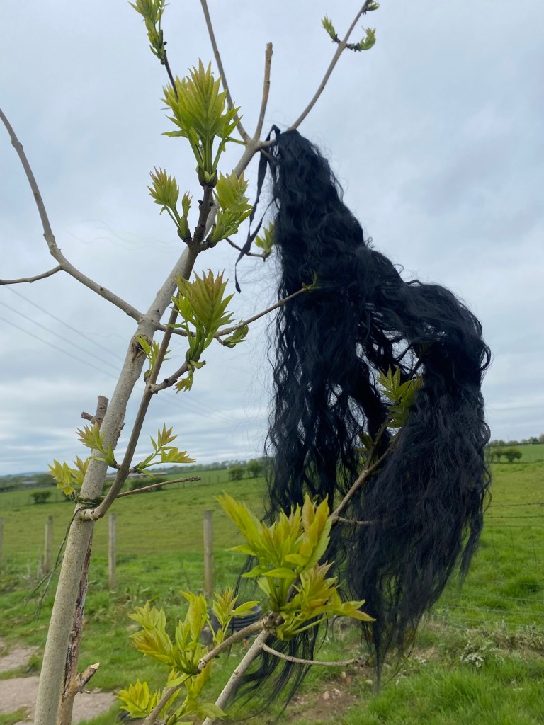
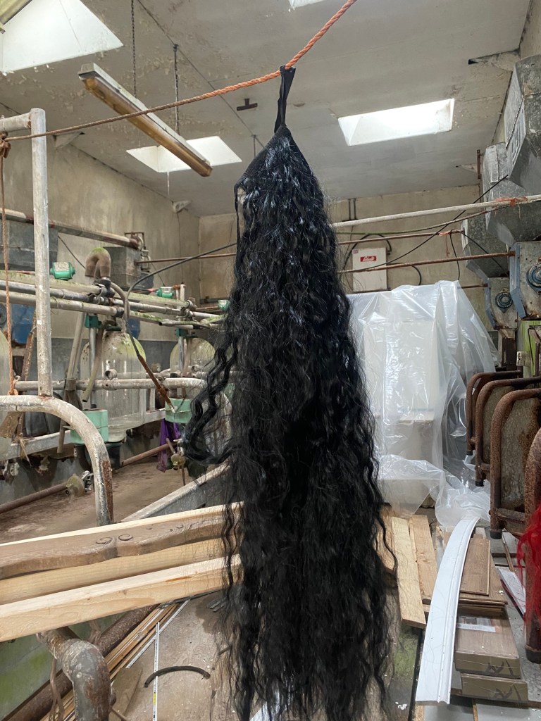
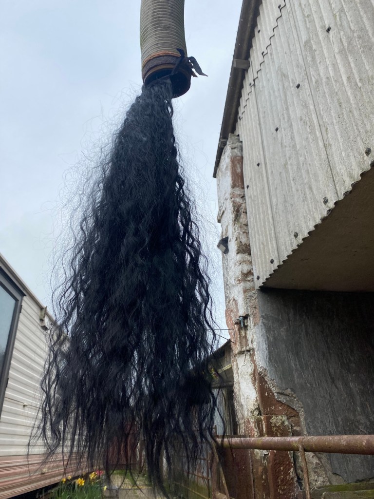
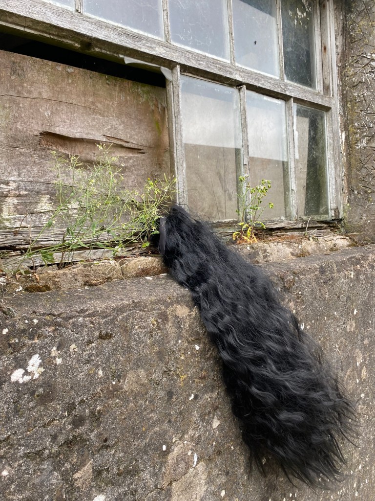
A quick photoshoot:
Placing the hair around different parts around where I live to create different metaphors and stories…
To Do:
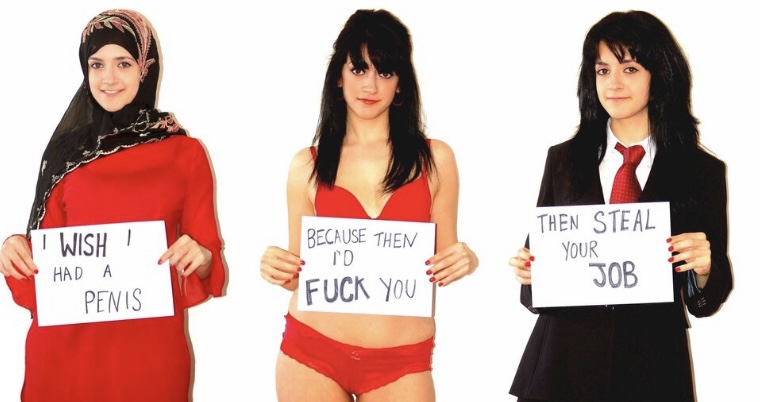
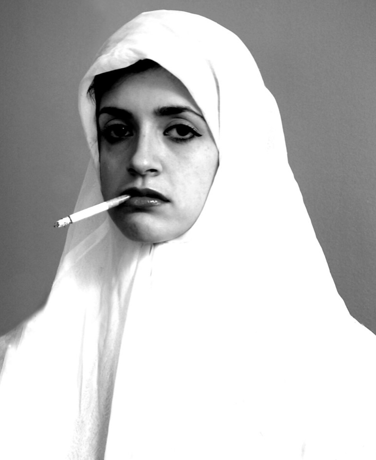
Feminist Artists Making a Bold Statement:
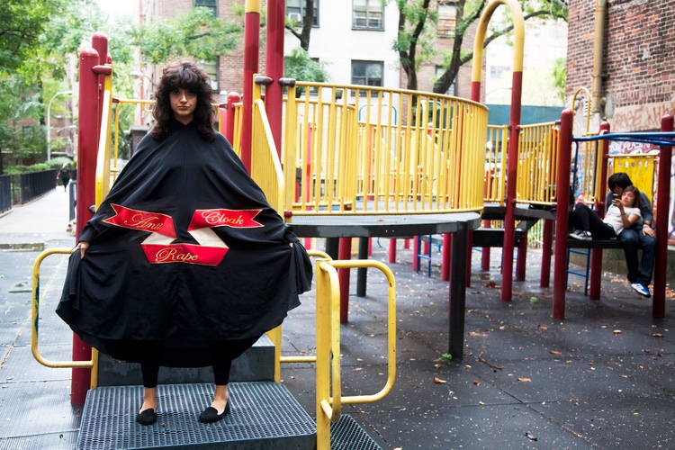
Photographer, painter and performance artist, Sarah Maple is one of England’s most inspiring and influential artists and has invented a refreshing and powerful visual voice. Her work explores what it means to be a young woman, and moreover, a young Muslim woman in the 21st century. She is bold and unafraid.
Self Portraits:
Performance Art:
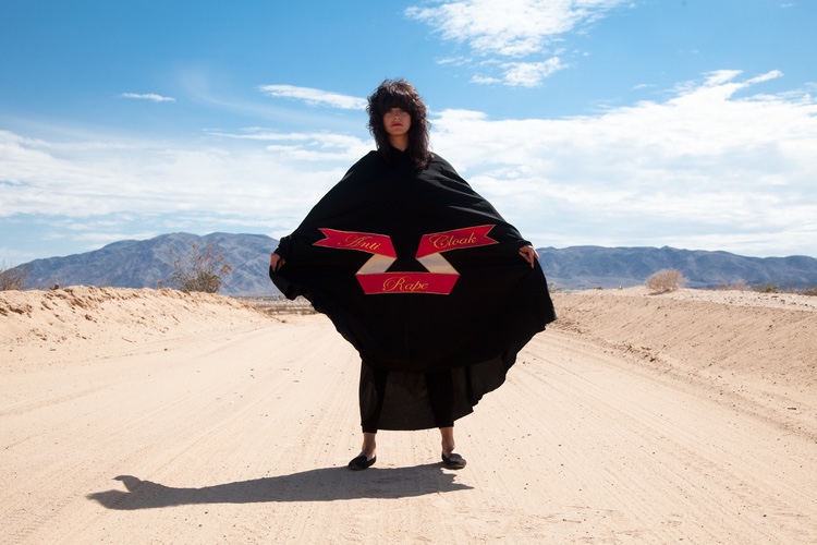
Anti Rape Cloak, 2015
“Anti Rape Cloak” was created in 2015 as part of ‘The Sisters of Perpetual Resistance’ residency, where she was asked to create an ‘object of nuisance’. Taking the cloak on her journeys and photographing herself wearing it in different locations and situations.
It is significant and noteworthy that she wore the cloak in so many different places, as rape can happen anywhere. Also, I like the fact that she appears as a goddess – protecting people from this violent and unjustified act; she is omnipresent.
Paintings:
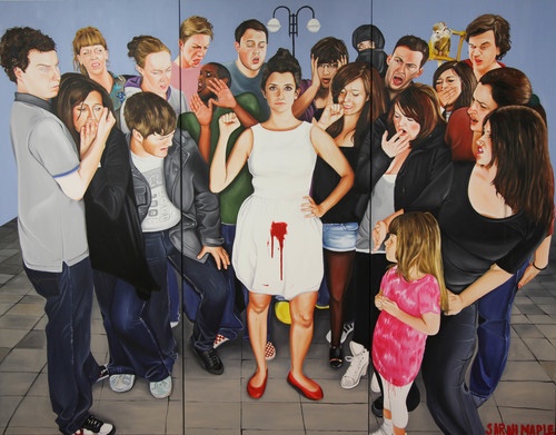
Menstruate with Pride, 2010-2011
– Immensely courageous and brave, and rightly so, she is not ashamed of her period. The people surrounding have been brought up to believe the idea that periods are unhygienic and dirty, however, they are not and women should feel pride in it.
– The fact that the child is the only face that is not disgusted by it, but instead looks curious and keen to know is striking and represents our society, and that adults are more judging than children.
– It is also interesting how women are showing looks of disgust as they menstruate too, however and sadly, the patriarchy has punctured us against each other, yet I will show a change in this and how women now stand together.
If I loved you it was because of your hair. Now that you are without hair, I don’t love you anymore. – 2010
– Relating to the women in Iran and how they cut off their hair to gain control, it is impactful and brave.
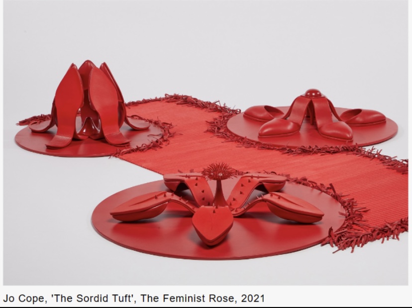
Artist, Jo Cope explores roses in fashion, curator Amy de la Haye, sustainable flower designer Shane Connolly and performance artist Xrestina Prompona leave a statement in the presence of a striking red rose.
Jo Cope creates conceptual shoes, which allude to the themes of feminism and ageism, and The Feminist Shoe is a triptych of sculpted pieces featuring a hybrid rose and stiletto shoe:
• The piece is clearly a bold symbol, as it is all red which is one of the boldest colours on the palette, especially when it stands alone, which is relevant to the fact that I want to use the colour red in my final piece. • To me, the most impactful element of this piece is the fact that the shoes are turned inside out and upside down which depicts that women are not afraid to break society’s rules. It is also significant that the shoes are pointed, as if to cause harm and violence to anyone that dare cross them. • Relating back to this recurring theme of unity in women and protest, there are multiple roses here which again creates a greater force.
• The spikes protect her • Connotes the idea that if you try to touch the flower, it will eat you up like a Venus flytrap, the rose warns people to stay away and not touch – men in particular.• The large scale of the shoes/roses are significant as it depicts a “giant woman” which then connotes fear and terror as people generally fear beings that are taller and larger in scale than themselves.
Overall, I believe that it is impactful to use shoes, as it can suggest that women walk and are free to walk where they like – they choose and walk their own path, with no fear.
Performing a ‘human plant hybrid’ provocation involving figurative poses that blur the boundaries between people, objects and environments:
It features the story of a retired assassin’s revenge against a man who tired to kill her whilst she was pregnant – it is violent and represents a woman as threatening, not weak which is something I intend to take inspiration from.
From this, hair is fascinating and shows identity – it is different for everyone and is one of the traits that make us unique. Also, the fact that it is one of the traits that separates us from men is fascinating.
Fashion shows focusing on feminism:
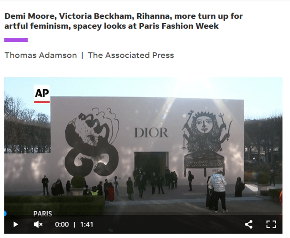
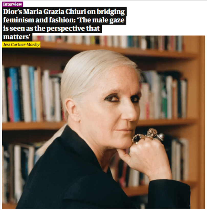
Maria Grazia Chiuri is a proud feminist designer that, in this collection, uses the male gaze, as reflected in female oil portraits throughout history and makes a statement on female empowerment and change.
One of the garments from the show:
After reading this article, I believe that it is important for large, well known brands and designers to spread the importance of feminism as it will reach more people.
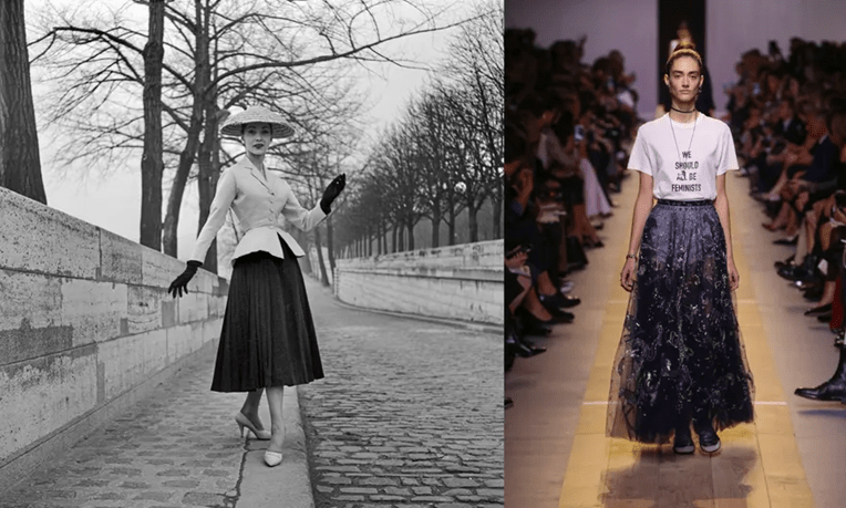
In 2016, Maria Grazia Chiuri made fashion headlines with the famous quote by Chimamanda Ngozi Adichie quote, “We should all be feminists”. The look hit a nerve, as feminism is seen as oppositional to femininity, though it doesn’t need to be – this view is antifeminist, as feminism means equality of ALL women, which is something inspirational to me from this design.
In her spring 2023 collection, her prime inspiration was female figure, Catherine de’Medici who made her way as a woman in a patriarchal society over 500 years ago. A woman that created power dressing, using an all black wardrobe to express her despair after the death of her husband.
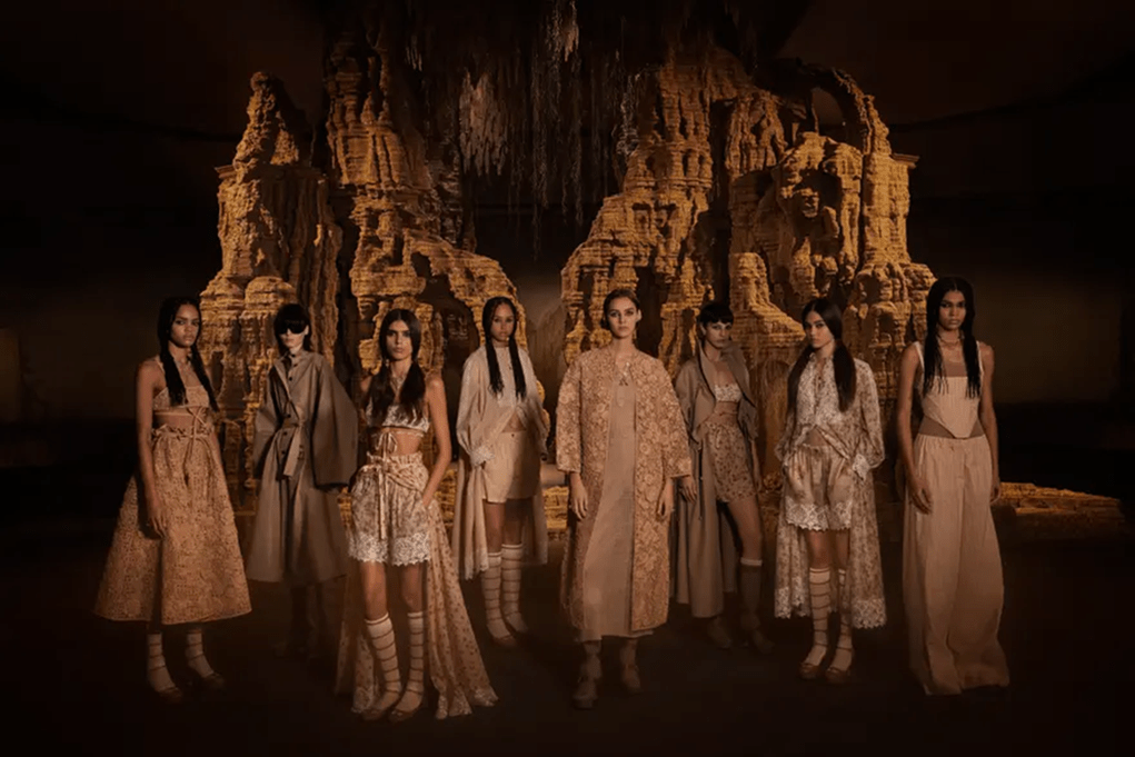
The collection is powerful in representing unity and sisterhood. Though different garments and looks, they all look very similar and do not differ too much which is significant as it does not stray away from the idea of union. Also, I believe that the choice of the nude palette is impactful as they look natural and like goddesses. To reemphasise this is the natural background as nature is powerful and so are women.
However, a negative of Chiuri’s feminist vision is that she does not include diversity in her shows and works. When questioned about this, her response was “They are just models, the girls who show the dresses.”, which I believe is hypocritical of her beliefs as feminism includes all women.
Catwalk collections that depict the power in women:
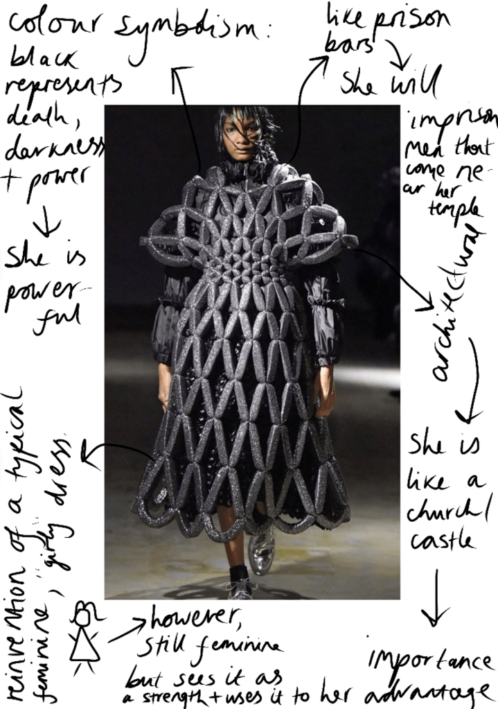
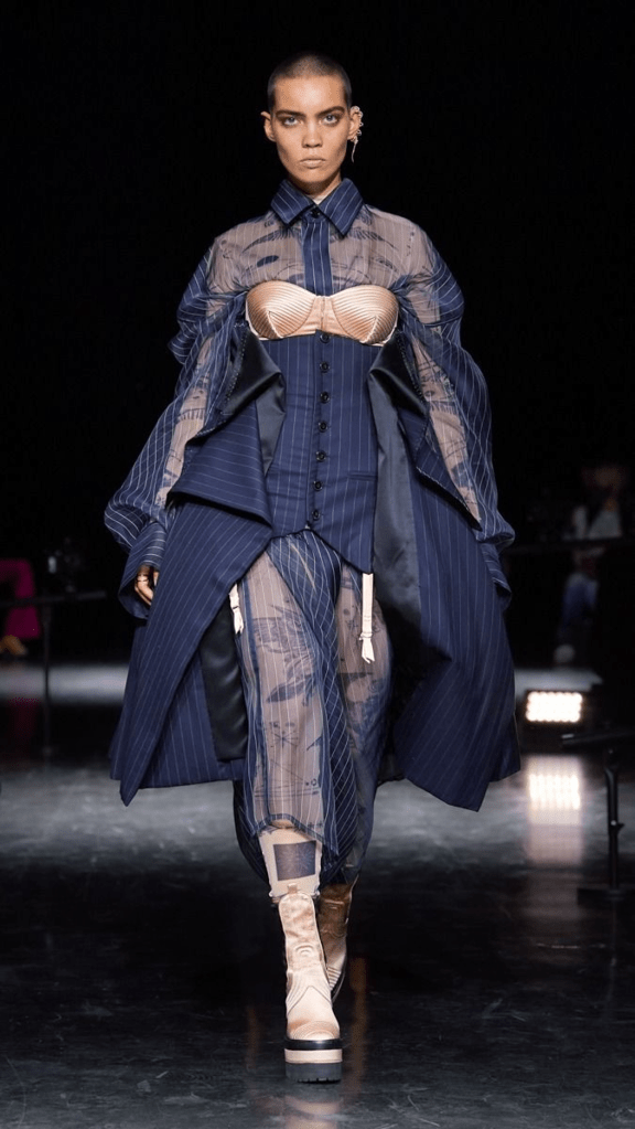
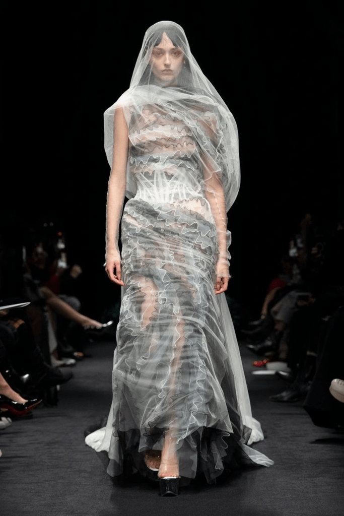
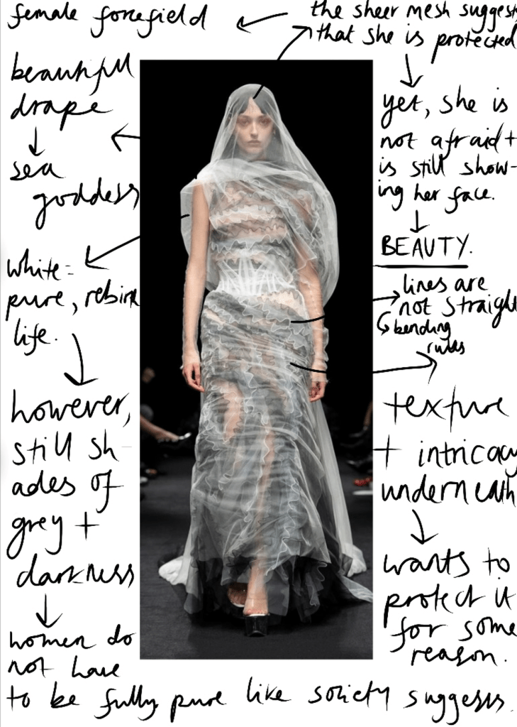
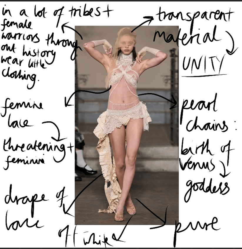
Designer, Dilara Findikoglu is a contemporary designer that is a strong pioneer in feminism. Her garments are instantly recognisable and unique, she is unapologetic about the work she creates and each piece has a powerful message. From finding her, she is now one of my biggest inspirations in this project, as she shows power, beauty and STRENGTH in each one of her pieces – which is something I wish to recreate.
“The Ruler of 7 Seas”
‘Not a Man’s Territory’ AW23 – Dilara Findikoglu:
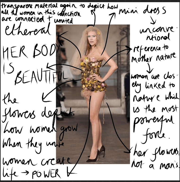
The collection, “Not a Man’s Territory” A/W 23 screams at the fact that a woman’s body is her own – through weapons, flowers and transparent materials these models are closely linked and stand by each other.
In this piece, I am fond of the thin mesh fabric that is over her, as it represents a force field of protection from men – they cannot touch her, or harm her which is a powerful message. Also, the transparency of the garment is something I am inspired by, as I want to show how transparency between united women is vital in order to protect and stand by each other. Another aspect I like of the garment is how it hugs the female body – an hourglass shape, which is something I wish to recreate.
However, the fluffy material used for the skirt is something I dislike in the design, as fluffy, soft materials do not connote strong and hardened women, therefore in my final design I wouldn’t use a material like this. Though, I do like the nude/off white colour of the fabric.
This garment is central to my project, as it includes the trapping of hair, which is something I have done before through bonda web. However, in this garment it looks more clean and seamless. Again, the transparency is vital as inspiration for my topic, and the fact that multiple models in this collection include transparency shows their unity, therefore in my garment I will show this in each design. It looks like her hair is her protector and strength.
Although this garment states “less is more”, I feel that something is missing. Perhaps, the shape could be exaggerated therefore this is something I will take in to consideration for my final piece.
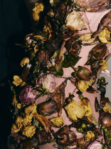
Flowers symbolise growth which is another focus of mine in my united women, and what exaggerates this is the fact that they are glued together and is a metaphor that women “stick together”:
One thing I dislike is how the flowers are all clumped together with no thought, to alter this I would show them gradually growing up her as it symbolises a journey and a woman’s story in her growth.
The knives have been placed with thought to symbolise the female form – making a direct link to women and strength. If you touch her, she will harm you. Moreover, I like the contrast of black and silver and how it represents the different shades of a woman. The slim fit that creates an hourglass figure separates us from men which shows our distinctive strength. Slightly raised shoulders, throughout fashion history depict power, respect and confident, as psychologically a person with slumped shoulders is usually lacking confidence but here she is confident and prepared.
If I was to alter the garment, I would raise and exaggerate the shoulders even more, and possibly even make them sharper to overemphasise this female power and authority.
The off white colour is something I am inspired by and would potentially use as the colour of my fabric as it is slightly nude and makes the model look like a Greek goddess, which is notable as Greek goddesses were known to be powerful in Ancient Greece. Also, the lace is significant as it is a typical feminine material and due to the fact she looks powerful, it recreates the stereotypical delicateness and creates a beautiful but threatening woman.
To me, inspiration is lacking in this garment, it has been seen before and I am not entirely inspired by the structure of the garment, I believe that the designer could’ve altered the structure to make it more unique.
More artwork by Dilara Findikoglu that inspires me (fine art, fashion photography):
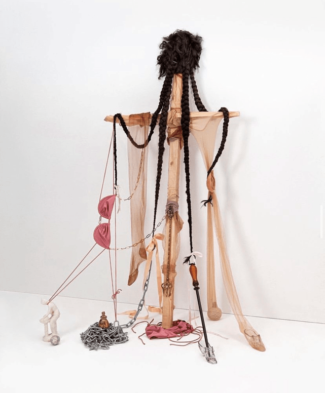
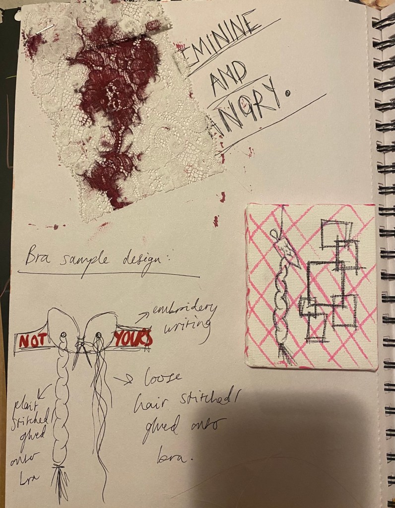
‘Portrait of a Saint’, 2022
Feminity and power: plaited hair, bra, tights, pink, girls shoes, chains, poker and crucifix – by using these stereotypically contradicting objects, the artist is showing that you can be feminine and powerful, the two can coexist.
Femininity is your power
Using a crucifix is important to note, as this is the most well known symbol to define God, and by using this it is a metaphor that women are godlike.
‘GIRLS: Bulletproof Cupid’, 2022
A feminine throne… she is royalty
‘The Birth of a Saint’, 2022
Combining women and nature – two powers meet to become a greater one as there is a close link between women and nature
Rebirth, growth in women
‘She is reborn in full force!’, 2022
A large nest – it is a large, powerful creature that has been reborn
In conclusion, Dilara Findikoglu perfectly represents the strength and resilience in women – they are not victims, and refuse this title as they don’t give the oppressor the satisfaction. In the collection, I also favour the different narratives given to the models garments and how they are linked through transparency.
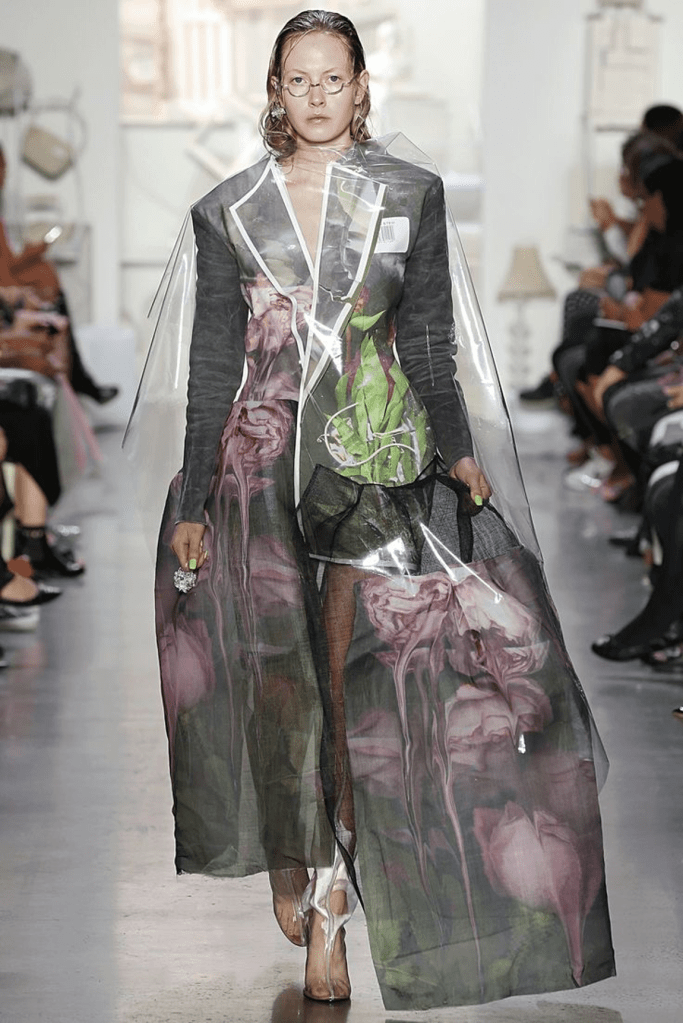
Elena Velez’s version of feminism is driven by both history and fantasy, earth and the divine which is something I wish to incorporate in my final design.
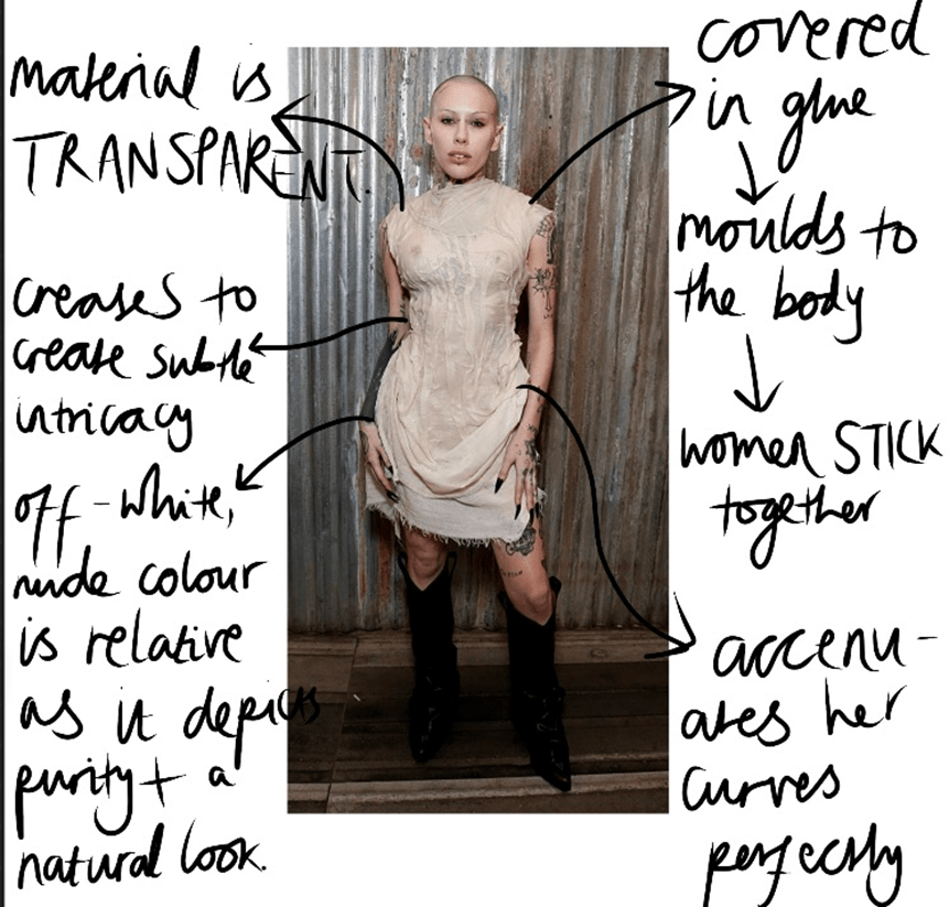
‘How’s My Driving?’ AW23 – Elena Velez
A simple but effective garment – the thin fabric moulds to the woman’s body to perfectly display the female form, and to help this more so the glue has reiterated this mould. The colour of the fabric is something I would take forward as inspiration for my final garments as it relates to Greek goddess statues and naturalness. Transparency in the dress is also relevant and I like how it opposes stereotypes that women should cover up – it is a statement. Again, the glue signifies that women stick togetgher. Additionally, the way the glue has made its own textile and has created layers inspires me – the garment becomes less flat without using stitch.
It is simple and works this way but for my final design, I want it to be slightly more eye catching and impacting. Therefore, I would use a more dramatic shape rather than such a conventional and use different prints and stitch, which hasn’t been done here.
It is dramatic and I am fond of how there is clear Victorian inspiration but the model has reinvented this by revealing one of the thigh’s at the top, which would have been completely unconventional and immodest for a woman to wear, which is rebellious.
However, the cage structure is something I dislike, as though I paid attention to cages and how it represents a woman feeling trapped, I now want to show power and strength and if she is caged that doesn’t communicate well. To change this, I would make links to the unfolding house/cage that I have paid attention to throughout.
In this garment, I am deeply inspired by the silhouette and how the dress fits the model perfectly and then widens at the bottom slightly, as it is similar to my initial final design shape, however, mine is more exaggerated. Also, the cut outs of the dress and how they are connected through “shoelaces” stands out to me, as it could be done through weaving hair.
Throughout this collection, the designer used the same colour for each model which represents the unity of the women, yet she structured and created the garments differently which is something I will take into consideration. Velenz shows that they are the same but different and have their own stories and personalities, which depicts diversity and accepted difference.
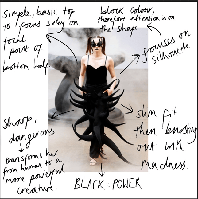
Qiqi Yuan’s brand, BUERLANGMA focuses its attention on fashion creativity and wearable devices. Its main values are liberty, richness and diversity which is what my project entails. The designer is on a constant quest to convey the courage, freedom and rights of women. In Buddhism, “BUER” means unique and “LANGMA” stands for ‘Qomolangma’, the highest mountain in the world. The designs are futuristic, bold and impacting…
BUERLANGMA AW23:
Slim fit then bursting out with madness: spikes are dangerous and this makes her dangerous and powerful – she should scare men. The way it transforms her from human to a more powerful creature is impacting.
Though black represents power and vengeance, I wouldn’t use it is a final colour for my design (will still use elements of it) as it is too literal and well-known.
Contrast of black and white is visually impacting and the sharpness of the colours emphasises this even more so. Her sharp shoulders are fierce as they connote confidence and pride.
To me, it seems slightly too pantomime like, I believe if the garment had enlarged shoulders at the top, like it does and then goes narrower towards the bottom it would be less Disney villain and more contemporary.
The metal corset is so distinctively powerful, as gladiators in Ancient Rome would wear a similar garment for protection and would have a men’s form (six pack) moulded onto it for aesthetic purposes to make them look stronger. However, women weren’t allowed to fight therefore this was never an item of theirs but here, the designer has reinvented the rules for the modern world and now SHE is a strong warrior. Also, the polished shine of the metal emphasises this and makes her resemble a goddess, as if she is bulletproof. SHE IS NOT FRAGILE.
Jean Paul Gaultier is known for his signature statement of the female form. In this spring 2023 collection, exploration of how to make a woman look strong and stand out is explored.
Spring/Summer 2023 Collection – Jean Paul Gaultier:
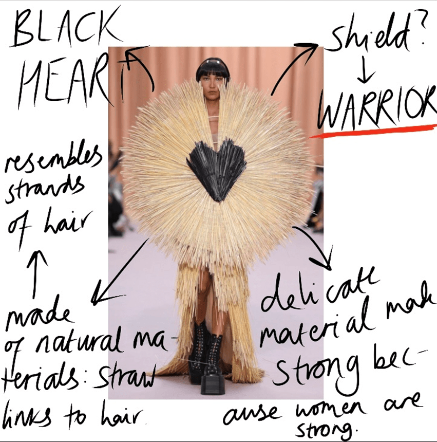
The texture and repeated lines is something that I am inspired by. It is abstract yet still highlights the female form/beauty and makes a clear distinction from men instead of dismissing it. The defining lines could resemble strands of hair.
Intricacy in this design is beautiful and perfectly woven. The tassels that drape down could be replaced with hair – the garment makes the woman look proud to be a woman. Another thing I am fond of is the headpiece and how it makes her look like a warrior.
However, I would add another colour to this garment as I believe it would create a greater contrast and make it stand out more.
Again, the intricacy in this design is impeccable as a natural material is used – straw which links to hair. The garment also resembles a shield because she is ready to fight. Additionally, I like the split down the middle so that her face can be seen – she is unafraid and will not be hidden.
Relished in gold and black, the women in this collection by brand, Schiaparelli appear as Greek goddesses. They look like myth come to life, and they are – that is what this collection entails: to depict that every woman is a goddess.
AW22 – Schiaparelli:
This piece is a focal point – the three circles on her hands and head create unity and makes her look like an angel: a protector of women. By using a basic black dress, the large pieces are able to stand out more.
There is not much I dislike about this design but if I was to change one thing I would make the circle around her head bigger to create an even greater focal point.
The female breasts are made to look sharp and powerful, and this is a significant place as this is another aspect that separates us from men.
Dislike of the skirt and how it looks like an everyday office work piece.
From these collections, I have gained better knowledge and inspiration of how to make women look powerful through choice of fabric, structure and colour etc.
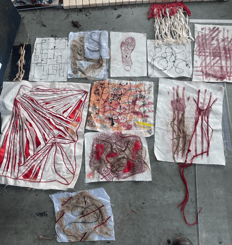
Condensing samples to use:
Out of all my samples I believe that these were the strongest to use (though some still need to be developed). From this, I want to focus on a colour theme that consists of mainly red, as this colour is powerful. Red symbolises anger, blood and threat which is representative of the rage felt by these women. I want each garment to be a loud statement but not too complicated, as I do not want the message of anger, sisterhood and unity to get lost.
Another sample/drawing that I will develop:
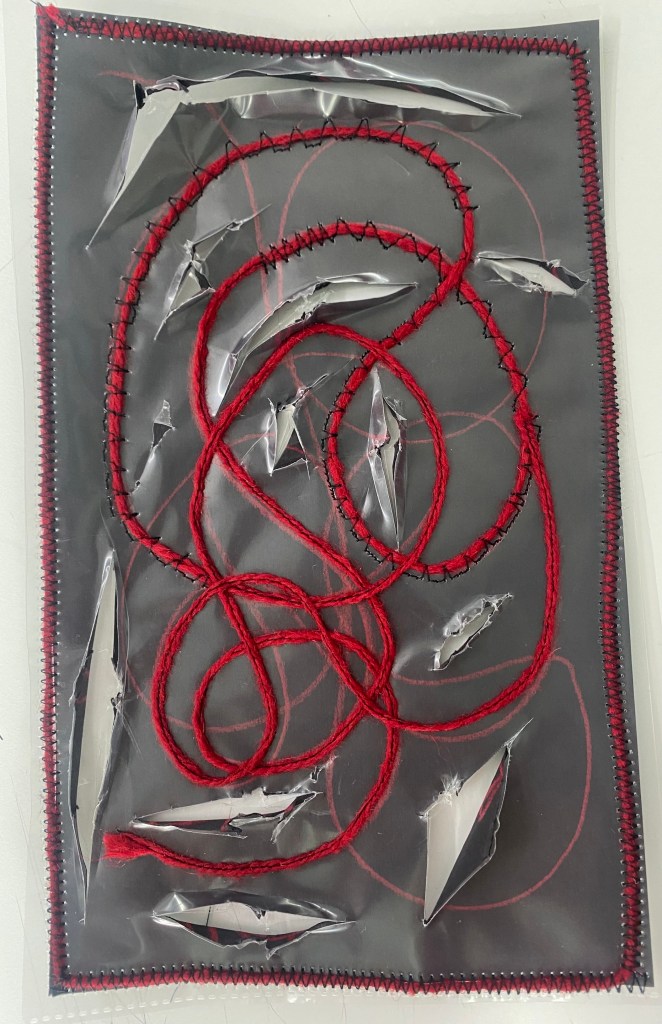
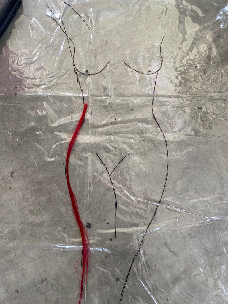
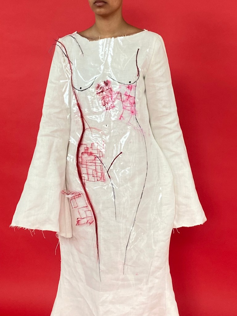
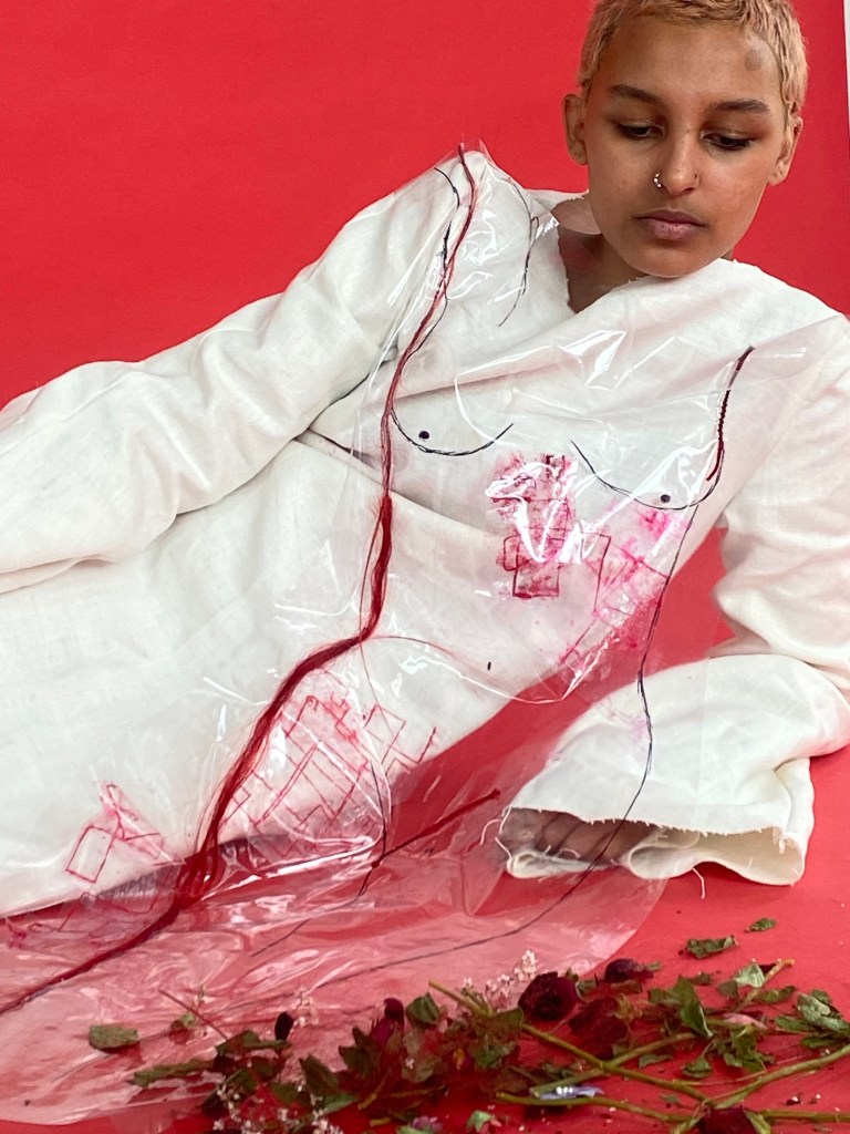
I will develop this sample also, and use a thicker plastic instead of clingfilm as it will be more suitable for stitch. The clear material is vital to be used as transparency among united women is key in order for us to stick together and make change.
Samples made from this:
Similar to the above, except I used a plastic wallet instead of clingfilm and drew the female body then stitched it using the sewing machine.
The petals are trapped in the plastic.
I used a zig zag setting for certain parts of the stitch outline as it depicts anger and sharpness in women – like thorns.
However, to develop this I would alter the shape and cut out the body, rather than have it as a rectangle – as that is a boring, generic shape.
Three of the same flower are used to represent unity and a group.
“WE ARE UNITED.” is effective, as it is a clear statement in what I am trying to depict.
A negative of this sample is the plastic that I used as it is not as clear as the other, therefore I wouldn’t use this plastic for the final design.
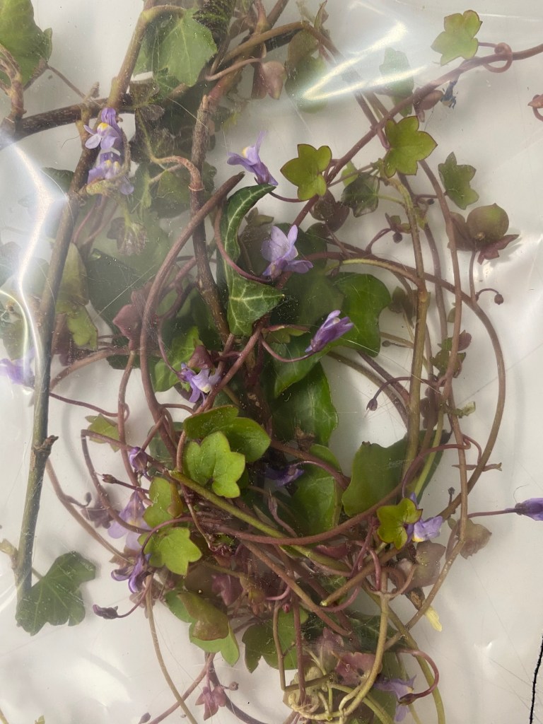
Notably, I chose weeds as people hate this plant and try to kill it, yet it continues to grow which I believe can be metaphorically linked to women, as they are hated and discriminated against yet continue to grow and flourish.
The ‘X’ stitched onto the sample is a strong “NO” to injustice.
To alter this sample, I would think more carefully about the order and presentation of the weeds. For example, I would start with a smaller cut flower and show it gradually growing.
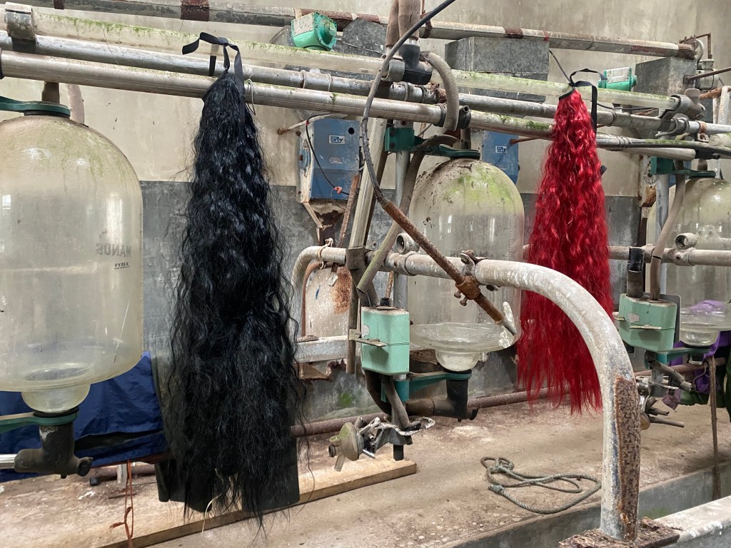
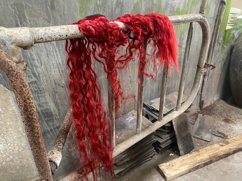
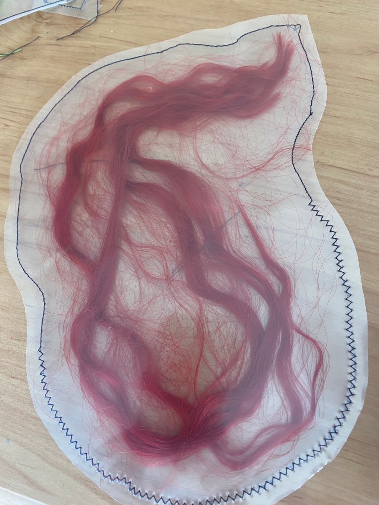
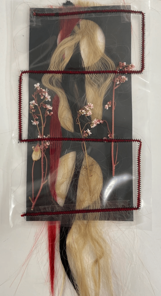
Trapping of red hair – the way the plastic covering makes the hair look so smooth and silky is beautiful.
Also, I like how it is a metaphor the protection of hair, which acts as a metaphor for the protection of women.
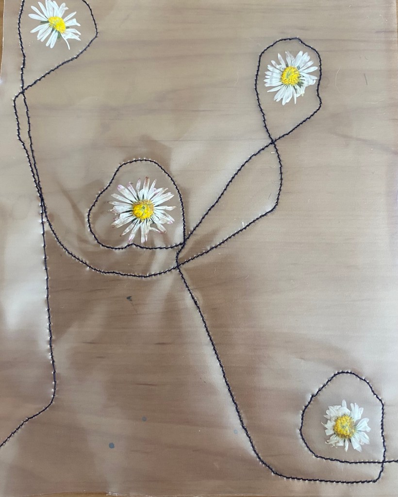
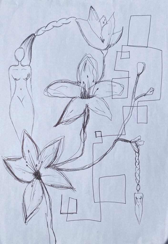
I chose to use daisies for this sample because to me and many other girls, they are symbols of memories from primary school when groups of girls would braid each other’s hair and put daisies in them, which depicts sisterhood and unity, even from such an early age.
Trapping the daisies in plastic and circling, and linking them together through stitch to show the linking and connection of women and girls.
Overall, I am fond of the simplicity in this sample and the meaning behind it.
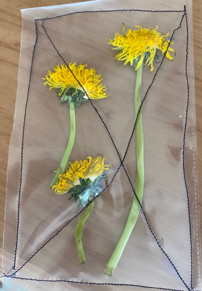
When using this flower, I paid close attention to the meaning behind it, people blow on this flower and the seeds fly into the air and it made me think about MOVEMENT and how women move where they want even when society or the government restricts them (e.g. in Iran). It is a symbol of FREEDOM.
I stitched and cut the sample into a cross to resemble this symbolic gesture of international women’s day:
However, if I was to use this sample, I would make sure to do a straighter and even cross as it isn’t refined and clear of the message when it is wonky.
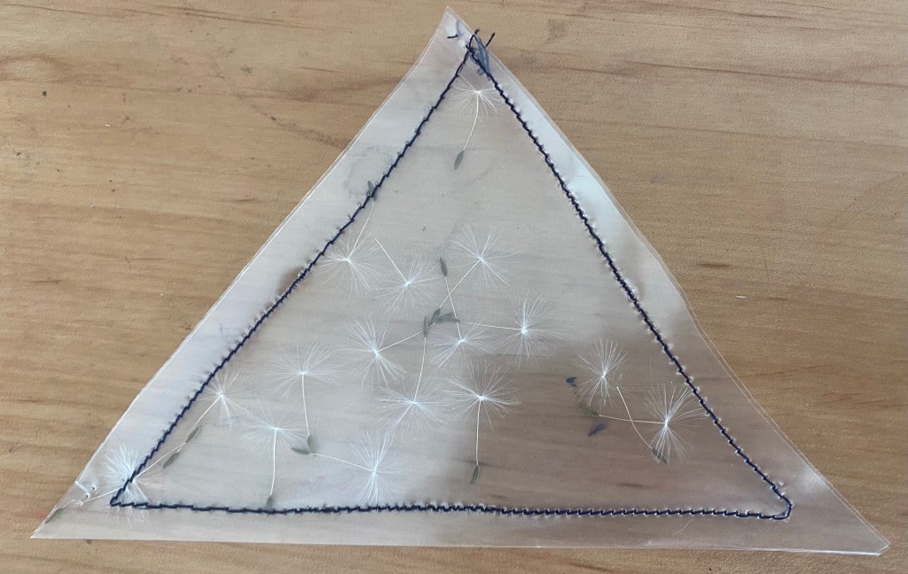
Another simple sample which contains the seeds of the flower in a triangle shape. I chose to use this shape as I haven’t tested this shape in sample yet.
Overall, I don’t think I would use this sample in my final design as it isn’t strong enough as the seeds don’t stand out compared to other petals and flowers that I have used. Especially, as I want the colour of the fabric to be white they wouldn’t show up, especially when photographed.
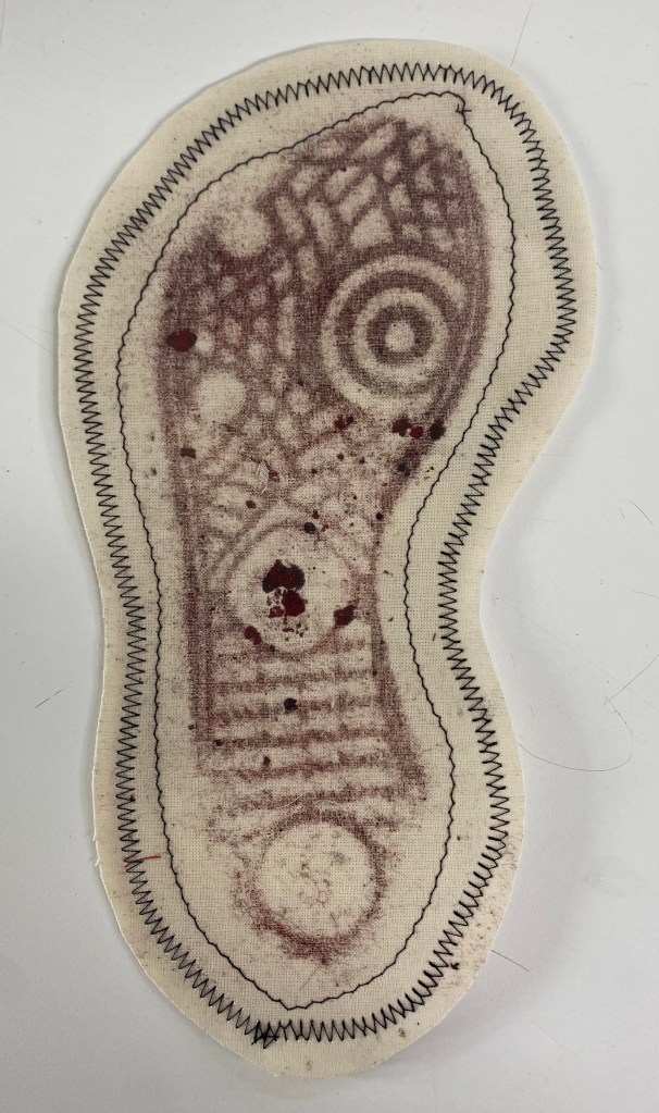
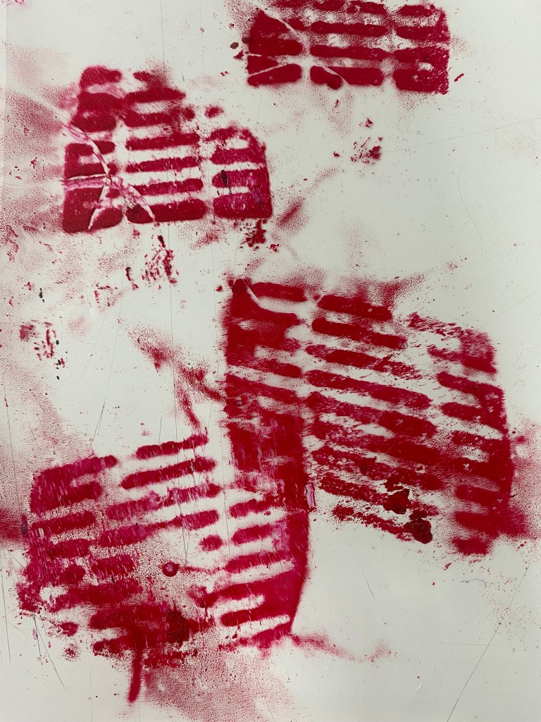
Taking the ink shoe sample from previously, I trapped it in plastic by stitch. I used a straight stitch to outline the shoe print first and then outlined it again using zigzag stitch, which shows the build up of anger felt by women.
Originally this sample had a meaning that represented how men walk all over women but since I now want to show women as powerful and not a victim, the meaning of this print has changed. It now means that women will stand on men if they try to stand on her, she will kick them down instantly. She is powerful.
Another thing I like about this sample is the shape when cut out, it looks more defined and sharp – it emphasies the shoe print.
Though I dislike the fact that none of the plastic is visible around the shoeprint, if I was to replicate this, I would cut some of the fabric away and let the plastic be shown.
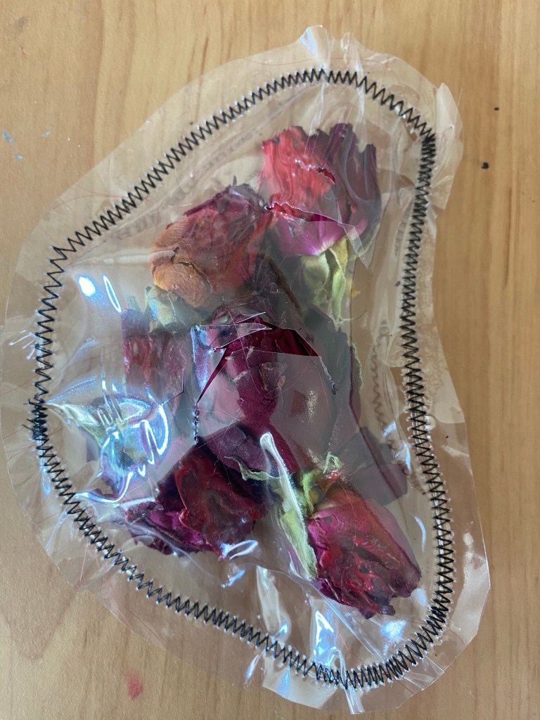
This flower had to be used as it stands out so vividly and beautifully. To start off, I trapped it in a simple square and I like the simplicity of it.
However, I think it would be more appropriate to use a red flower as it would look more fierce and due to the fact that my colour theme is mainly red.
This sample is a development of the previous one, I used a few other smaller plants to construct it and I believe it is effective because there are roots are roots at the bottom which relate to hair roots and growth. Also, the shape looks sophisticated and defined.
Overall, I definitely prefer it to the previous one as there is more attention to detail in shape, meaning and presentation. However, again I believe it would be more effective with red flowers as this colour is more relevant to the story I am trying to communicate.
In this sample I used red flowers and red hair and it is clearly more effective and representative of the anger, burning passion and rage in this project.
The objects in this sample were carefully placed in the plastic as the hair is in a loop and the flowers over the top – I am favourable of this shape and the loop represents the loop and linking of women. Whereas in the previous sample I used real roots, here it is more metaphorical and less literal – the hair is a metaphor for the roots for the flowers.
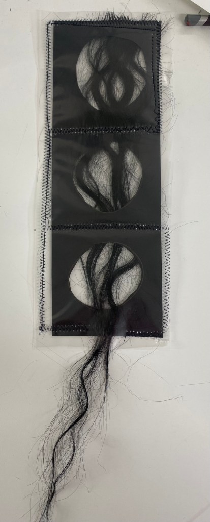
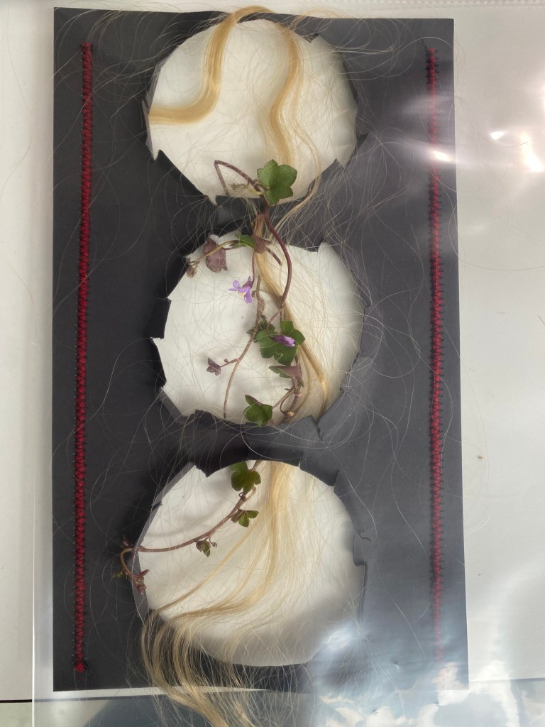
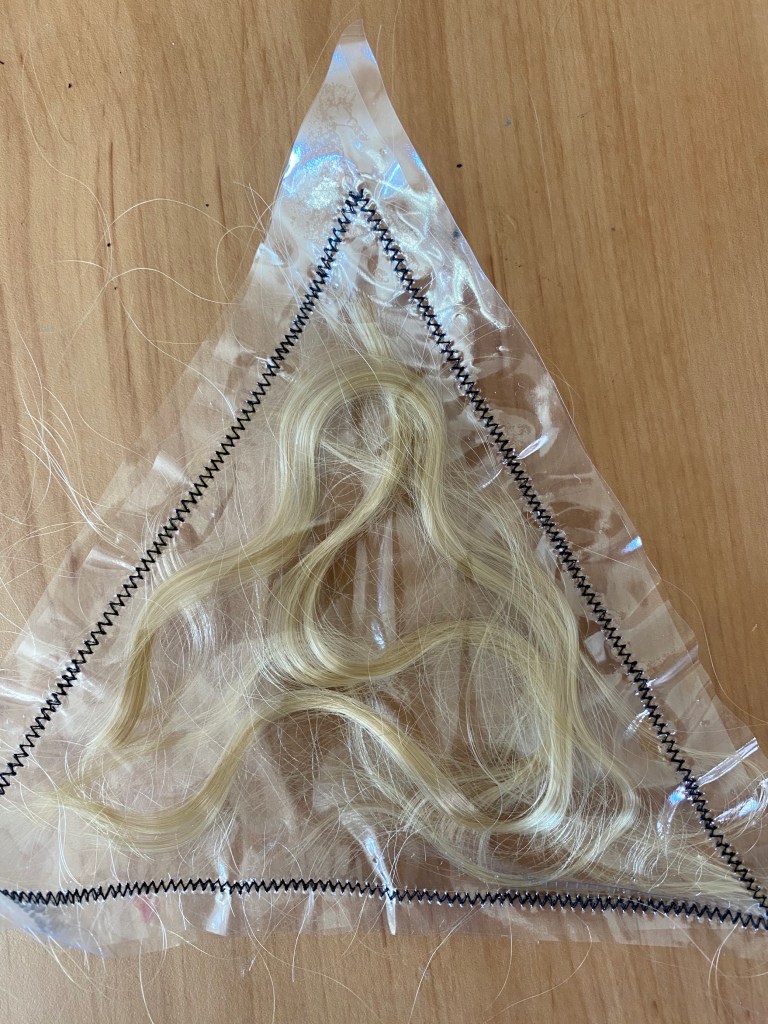
This sample is a reinvention of the straw one and instead I used hair to weave through it. By using a small amount of hair, the holes are visible and it looks clearer that the hair is weaved through.
However, I don’t like the black hair combined with the black card – it would be more effective with red or blonde hair as it would create a contrast and therefore stand out more.
In my opinion, this sample is highly effective. Here, I cut out more holes and looped different colours of hair through to represent diversity – I am fond of how strange it turned out. Also, the different sizes of the circles connotes diversity in women.
The way the zig zag stitch separates the strands of hair is something I will take forward for the final design. It looks intricate and like an abstract painting.
I dislike the use of the plasters as plasters represent harm and pain – these united women are warriors.
To me, this sample was definitely successful – I developed the previous one using a braiding stitch technique, flowers and different colours of hair.
I believe that the braiding technique stands out and looks more defined than regular stitch.
To change this sample, I would either cut the holes bigger or use a smaller aount of hair so that it iss clear that the hair has been woven through.
In conclusion, this is a sample that I will use for the final design, and will possibly be enlarged to fit the whole dress on the body.
Creating the sample sample on a larger scale:
(not as refined and looks rushed).
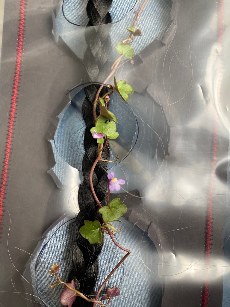
Here, in this sample, I used a black plait, straight red hair and flowers. In this design, I like the randomness in the arrangement.Also, I like how it looks like the flowers are growing from the hair – that the hair is the roots for the flowers.
Unintentionally, the shape slightly resembles the female body from the back. Therefore, if I was to use this I would make it more clear of this intended shape.
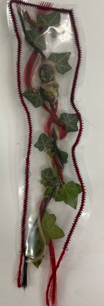
In this sample, I used a vine to twist and wrap hair around and I believe it is really effective in depicting growth and movement in women.
However, I believe that this one would look more effective with ordinary stitch as the braiding stitch is too distractive from the vine and hair as it is quite intricate and small in detail.
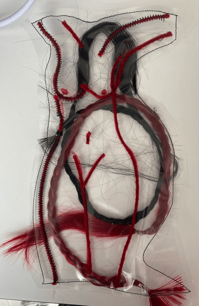
In this one, I drew the female body onto plastic as a template to stitch onto, I did this to get the most accurate look possible.
After that, I trapped red and black plaits, and stitched onto the outline using the braiding technique and red thread.
In conclusion, I am really fond of this sample and believe it would look impacting on a large scale over one of the dresses – therefore, will potentially use for final design.
In this small sample, the outline of the body gets slightly lost due to the hair, however, if this sample was enlarged this would change that negative.
In this sample, I did a similar thing to the others but instead cut the holes to look like someone has escaped – women are/have escaped the cruel world imposed on them. They are fighting and they are strong. Breaking barriers.
The appearance and aesthetics of this sample reminds me of Rapunzel, a childresns story that I have touched on previously.
By using less flowers and less hair, it is arguably more effective as you can distinctively see the holes and the transparency.
However, I believe this design would look more effective if the edges of the circles were rougher to appear more realistic in someone breaking through and escaping. Also, to include diversity I would use multiple colours of hair like in the other one.
Similar to the previous sample, except I used a black plait instead and don’t think it was as effective due to the fact that the blonde stands out over the black, whereas the black doesn’t.
In this sample, I cut holes into the fabric, rather than using card and wove the plait and flowers through the holes. From this, I like the fact that it is discrete and you have to look closely to see this, however I also dislike the sample for the same reason as well.
In trying this and the black card ones, I still believe that the others are more effective as there is greater definition and I belieeve it communicates better.
Again, I love the simplicity in this sample – I chose this flower as it looks like a tree and trees provide oxygen, they have roots and they live for a long time. They are a powerful plant, like women.
I trapped the plant in plastic along with a few strands of blonde hair and stitched around the shape of the flower, but not too closely as I wanted to give the plant room as trees provide oxygen so didn’t want the flower to look trapped.
I dislike the fact that there is only one plant, and believe that if there were at least three it would depict unity.
This sample is similar to the above in shape – the plants in this one all look tangled up – like a spider’s web, or a wasps nest and the metaphor behind this piece is that women are dangerous and will attack if needed. It also looks like a bird’s nest which depicts growth and rebirth.
For this one, I didn’t leave as much room and stitched very closely to the plants, which I believe works better for this one.
However, I don’t like the fact that the flowers aren’t visible, I believe that if I included a bolder, vivid flower into this it would create a greater focal point.
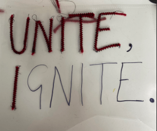
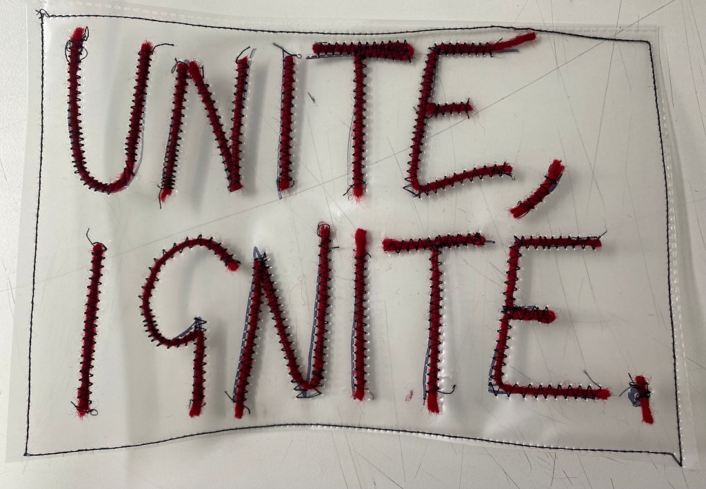
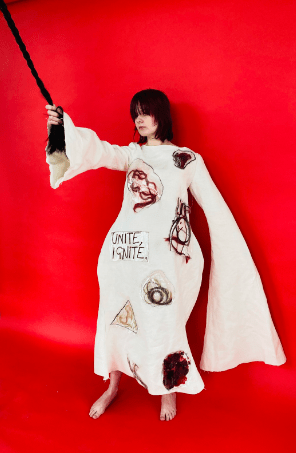
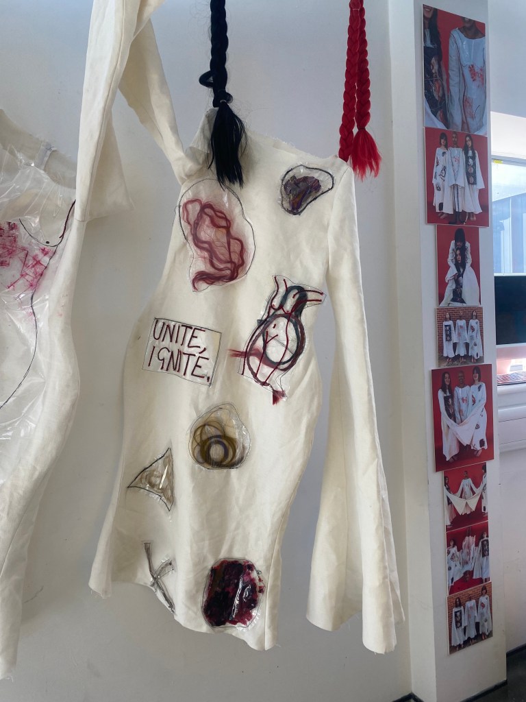
On plastic, I wrote out the quote “UNITE, IGNITE.” and then stitched onto it using the braiding technique.
I like this sample but believe it would be more striking if I let loose threads hang on the word “IGNITE”, as that would resemble hair.
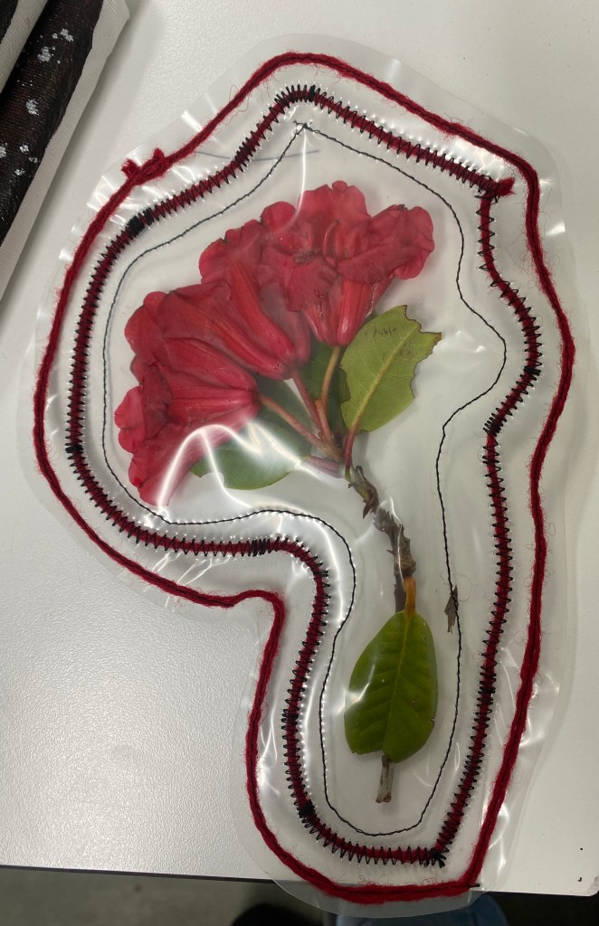
In this sample, I trapped a plant with red flowers and the fact that it is outlined in red emphasises the statement of this bold red colour, that represents anger and passion even more so.
Overall, this sample is one I will possibly use for the final, mainly due to the red colour and how there are multiple flowers on one plant – it shows togetherness and how we are all one.
Using black card, plastic and red thread,
Transferring previous ink samples onto plastic:
I began to print inks directly onto plastic. In this sample, I used a footprint. However, I don’t think this footprint was as effective as the shoe I have used previously, therefore will repeat it with the other hsoe.
Overall, I like the grainy effect that is left on all of these samples:
Swirls – strands of hair, abstract version of the female form
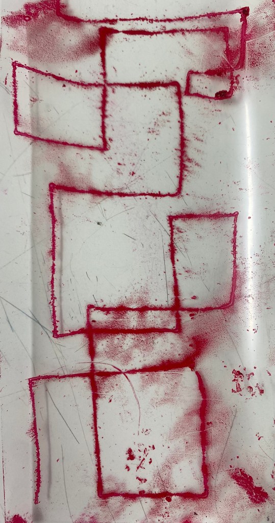
Geometric lines – the unfolding house.
More samples of previous techniques in condensed samples:
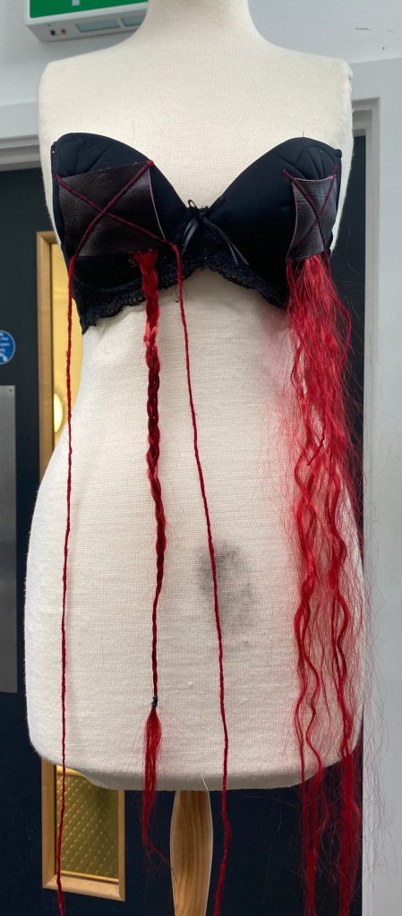
Here, I took a black bra, stitched leather squares onto it and trapped the hair underneath. The crosses on both leather pieces are a strong “NO!” in response to society’s control over women, a symbol that I have paid close attention to throughout my process, inspired by Antoni Tapies.
To use red hair is significant, as this colour symbolises danger and threat.
However, the leather pieces aren’t symmetrical, nor cut the same which I believe makes the garment look weak and unprofessional. Therefore, if I was to use this I would change this aspect.
Using the slashing technique, I stitched two samples onto another black bra.
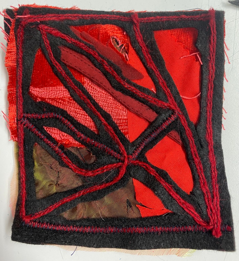
Recent samples that I won’t use:
Though I really like most of these samples, I won’t take them forward into my final garments as they are not as strong as the others and do not represent what I wish to represent as effectively.
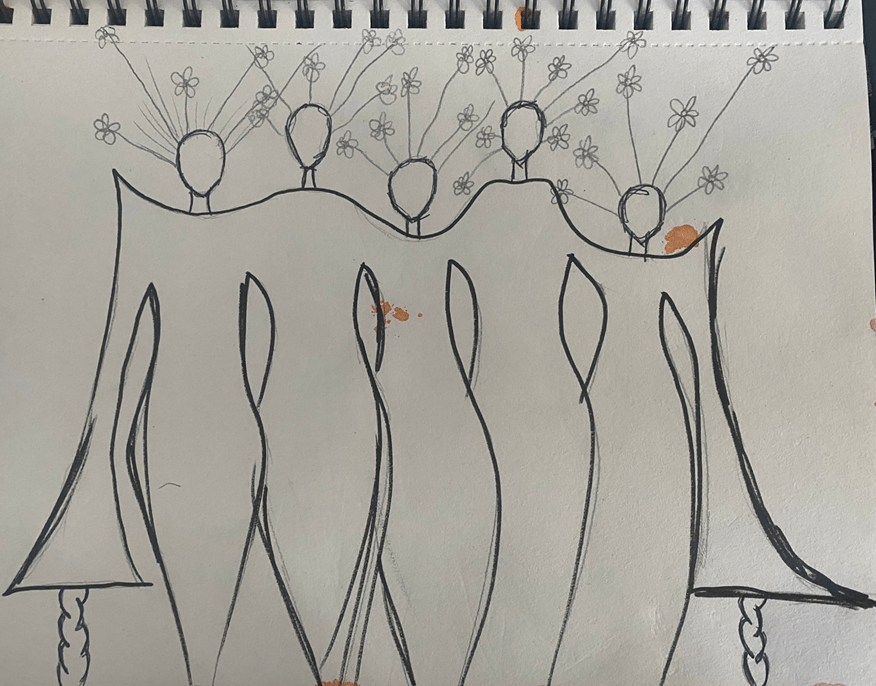
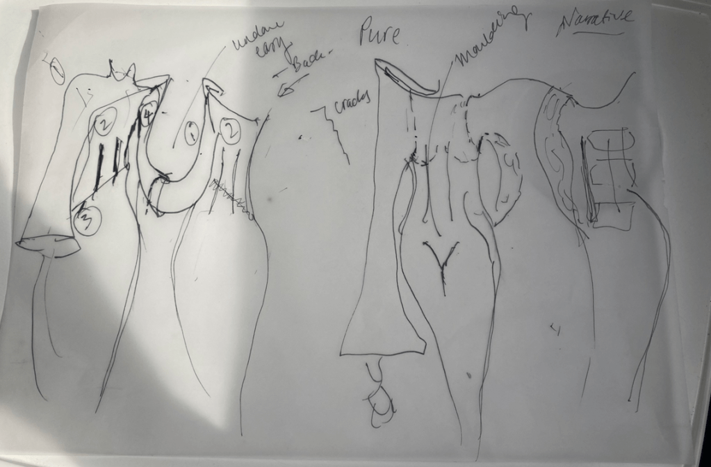
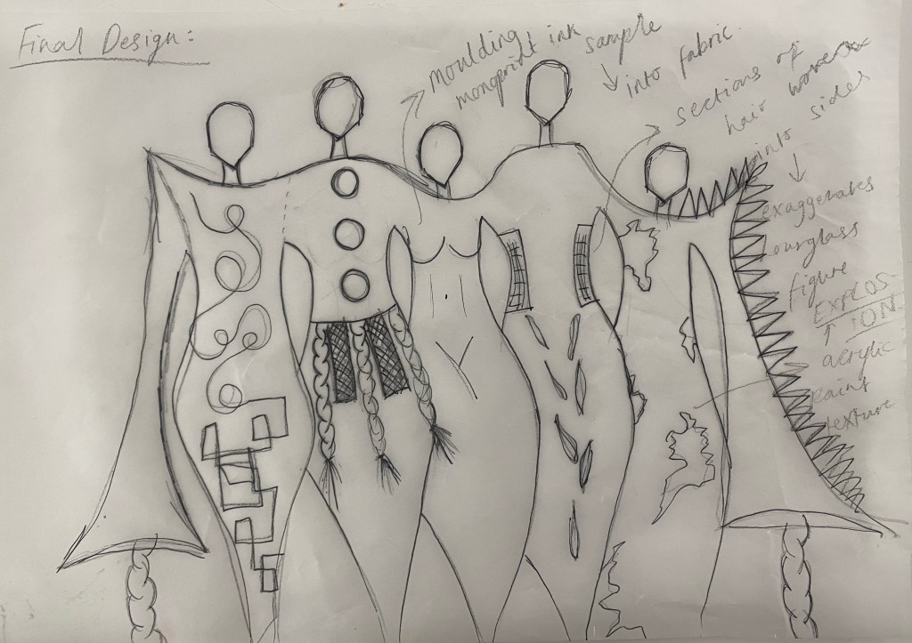
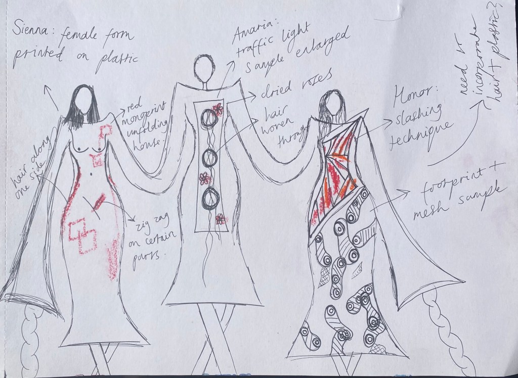
Final design silhouette:
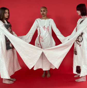
Concluding the silhouette of the continuous dress, I chose this one as I like the trumpet/chimney sleeves as trumpets make noise and chimneys are part of fireplaces – and fire and noise are what this protest is about.
The exaggeration of the hips and overall female form is something I will pay attention to in each garment.
One thing I may alter is the hem and how it fits to the model – possibly widen
Overall, I will aim to make five but three will still be effective as it displays unity.
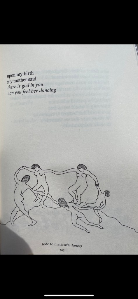
Poetry inspiration that inspired me to generate this design:
“The Sun and Her Flowers” by Rupi Kaur:-
However, in the previous design there was a continuous neck hole but for this design I will use separate neck holes like the above.
Thinking about technicality and logistics behind the design:
To create the illusion of a continuous dress, they will all be separate garments but will be linked by sleeves going inside other sleeves on other garments. However, the two models at the end, on their end arms will have a more exaggerated and lengthened sleeve to resemble that trumpet shape.
I will aim to make the sleeves fit into each other but models may have to hold hands in order for it to stay in place.
Another reason that they will be separate garments is because for the photoshoot, I want the models to be in different positions – lying down, holding hands in a circle, etc. and if they are so tightly connected this will not be possible.
Experimenting with different samples and arrangements to create a final design:
Sketchbook:
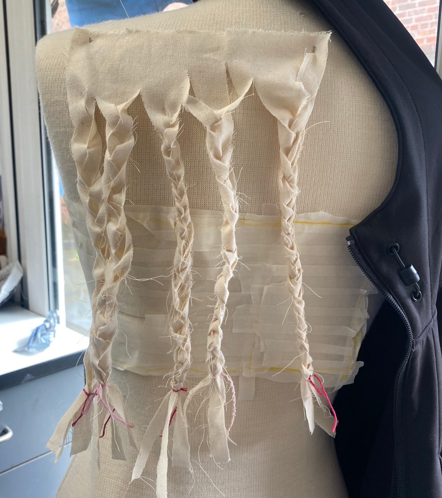
Beginning constructing the dresses:
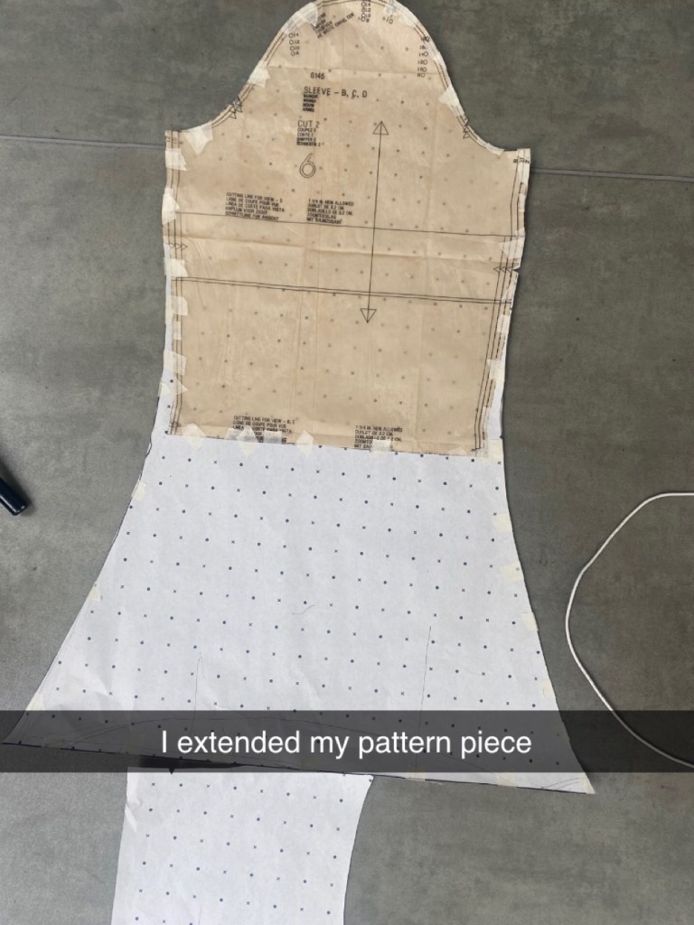
To begin the final, I bought basic patterns already cut to adapt to, as due to the short amount of time it would take too long to start from scratch.
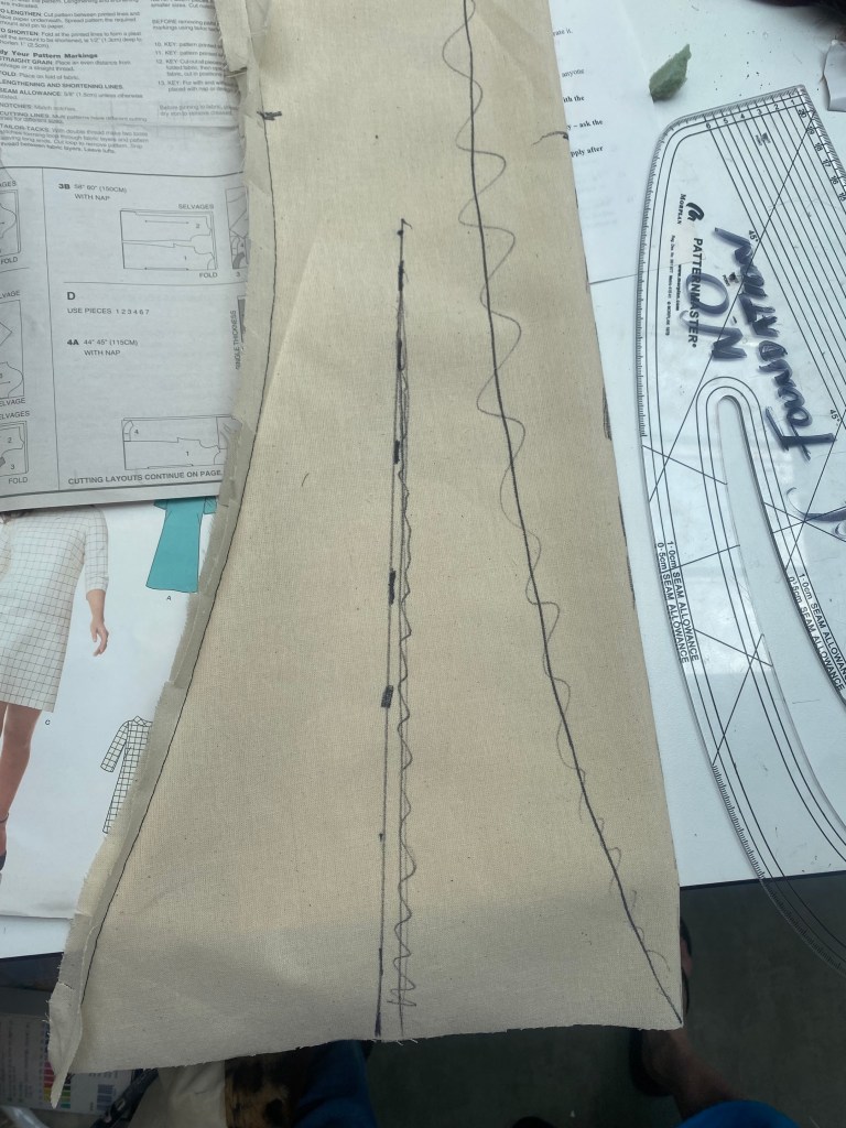
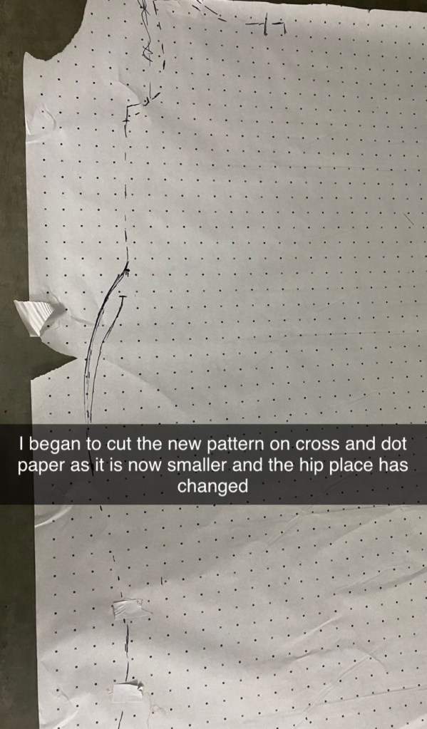
I pinned the paper patterns to the cross and dot paper, and began measuring and drawing out the desired shapes.
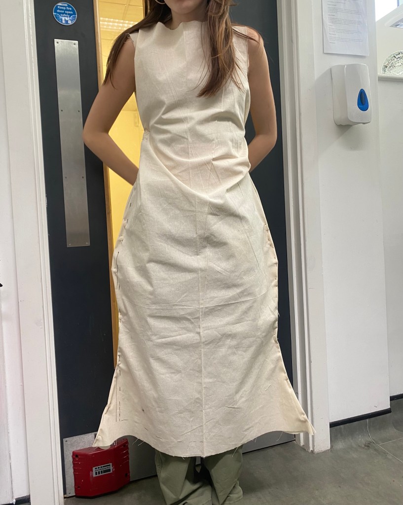
To start off, I did a couple of practice ones first in calico to see if the changes to the patterns were extended enough or if I had to extend them again…
Due to the fact that I didn’t cut on the fold, the front had two separate pieces when it was only supposed to be one, therefore there is a seam down the middle which I don’t want. For the final designs of the front pattern, I need to make sure that I cut on the fold.
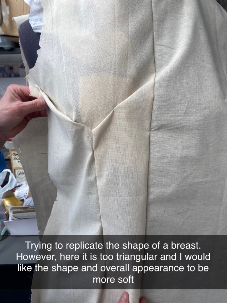
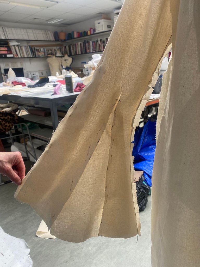
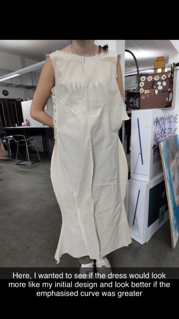
On my initial final design sketch, the shape of the garment is widened at the hips to make an hourglass figure. Therefore, will need to manipulate this possibly through piping to get the structure.
On my initial design and throughout this project, I have been drawing and paying attention to the female form, therefore, I will try to replicate this through darts but don’t want it to be too sharp and visible. Subtle.
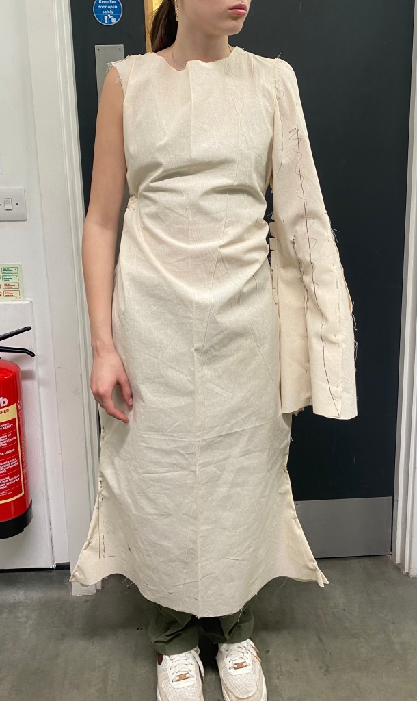
Beginning to make the sleeve:
Pinning the sleeve on the mannequin:
After pinning the sleeve to the mannequin, I can see that it doesn’t match the shape that I wanted for the final design as it doesn’t match the trumpet sleeve that I want to create. On the inner side, I like the shape but the outside of the sleeve is straight which I don’t want.
I began to add calico to the sleeve to try and achieve the desired shape…
And from doing this, I achieved the shape I intended. Also, it must be noted that this sleeve is for the ones that are going to be connected to each other by going inside each either, whereas the sleeves on the end, of the two models on the end will be largely extended.
Patterns for the first toile:
Drawing out the hourglass shape…
Pinning the dress to sew after cutting out the new patterns:
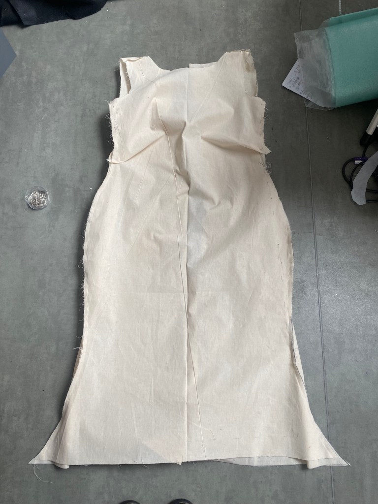
After sewing the dress, I placed it onto one of the models…
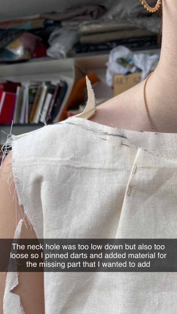
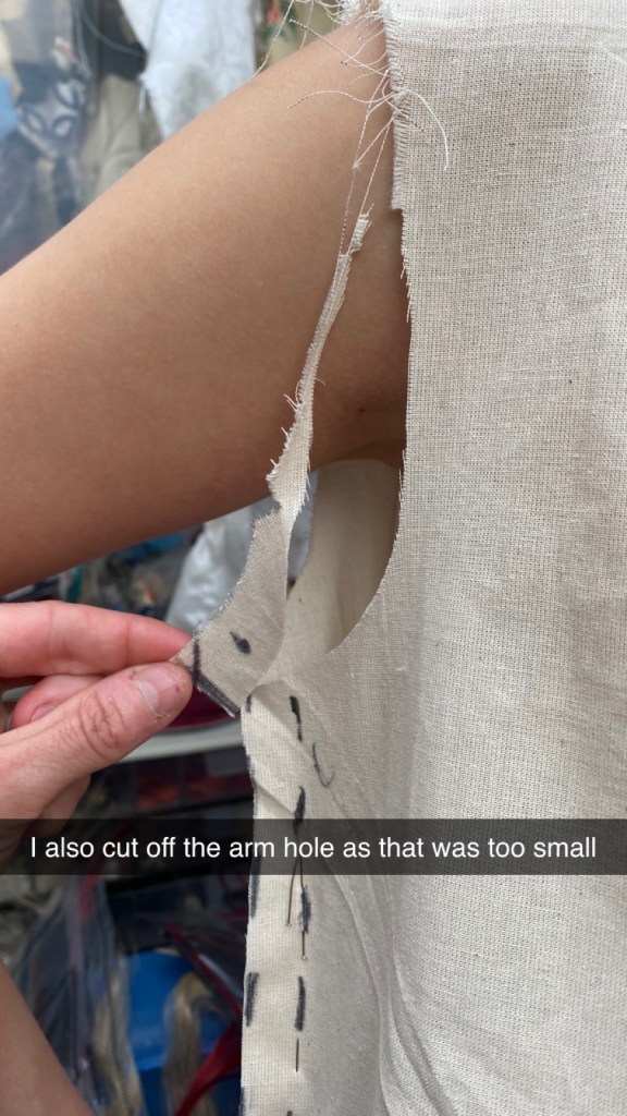
I still need to fit the dress and add the darts but from doing this, I like the shape that has been created. However, I don’t think stitch will be enough to hold up the defined hourglass shape so I am going to try and use piping.
Though this practice was mainly successful, I forgot to put the outer seams the same way, therefore for the next practice and final I need to correct this.
Another practice on calico:
This next practice was cleaner and neater.
Fitting the dress:
Thinking about aesthetics and creative design…
Altering the pattern of the new sleeve:
Attaching one of the sleeves to practice on calico:
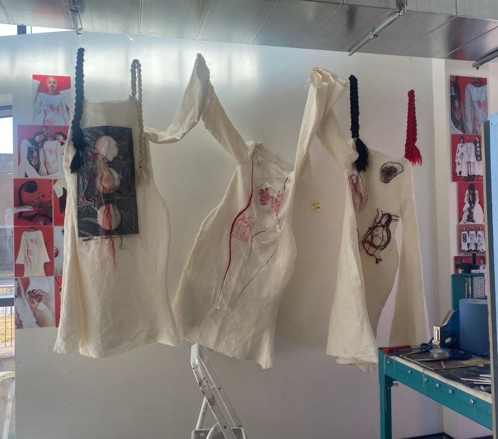
Overall, I have decided to create three garments instead of my original plan of five, as I don’t have enough time to create that many. As I would rather have three strong garments and a successful photoshoot, rather than five unfinished dresses and a poor shoot.
Thinking about composition and designs:
I don’t think the garments look strong, if the one on the left isn’t in the middle as it is the one that stands out the most and is most provoking.
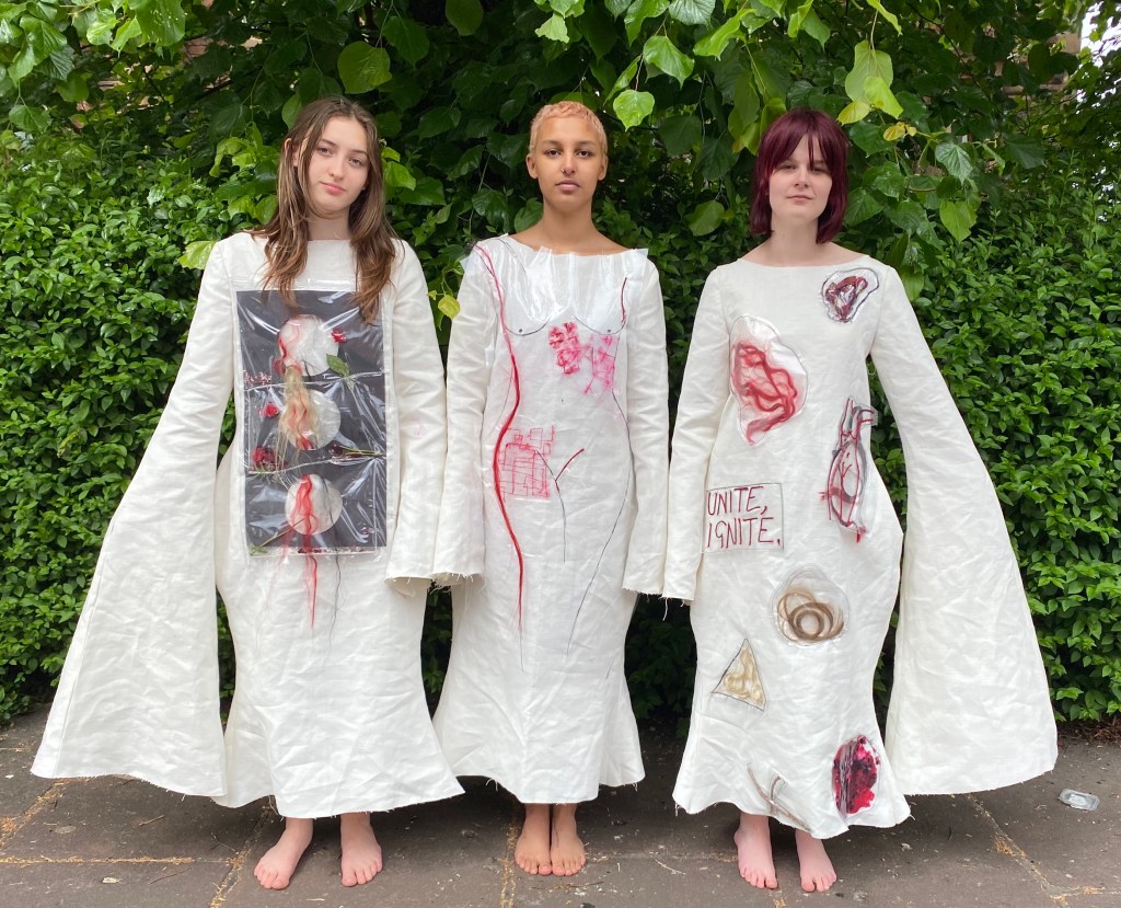
I came to the conclusion of this design and composition of garments, except the one on the left and the one on the right were swapped in positions for the shoot:
There is a great contrast in these garments: the left very busy, the middle simple and the right busy but simple as well.
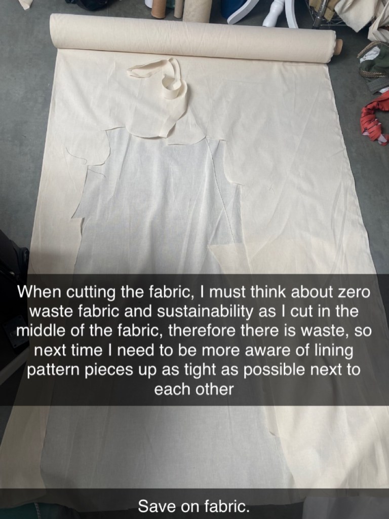
Beginning to cut the final garments:
First garment:
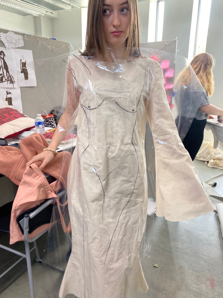
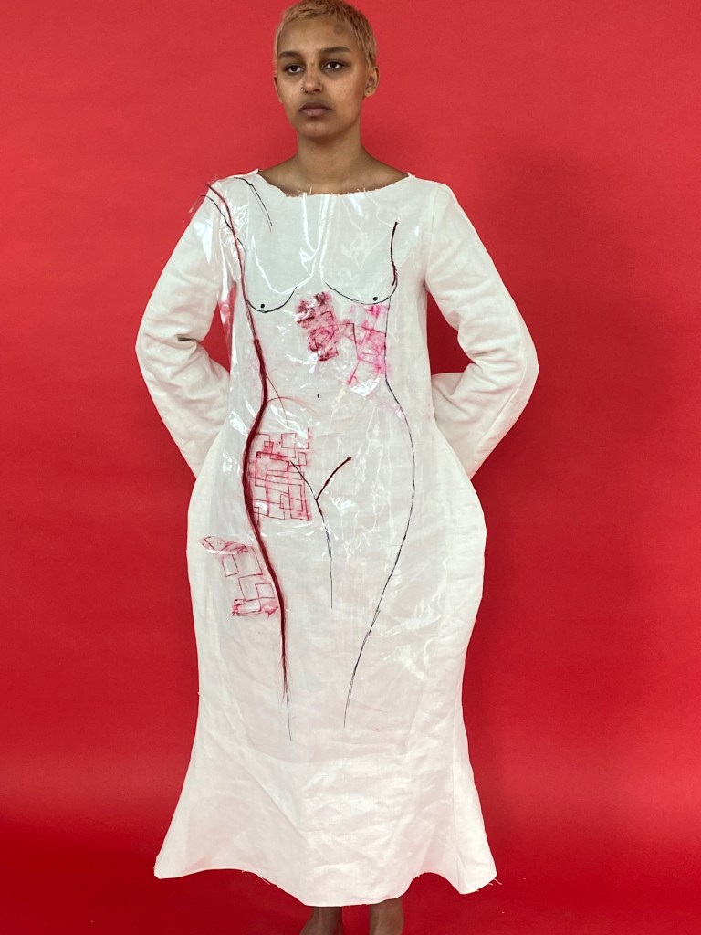
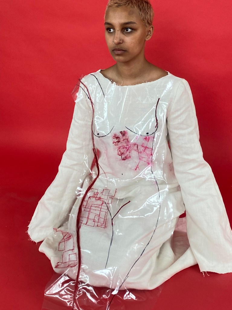
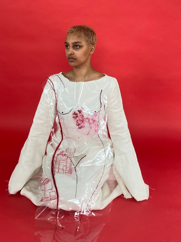
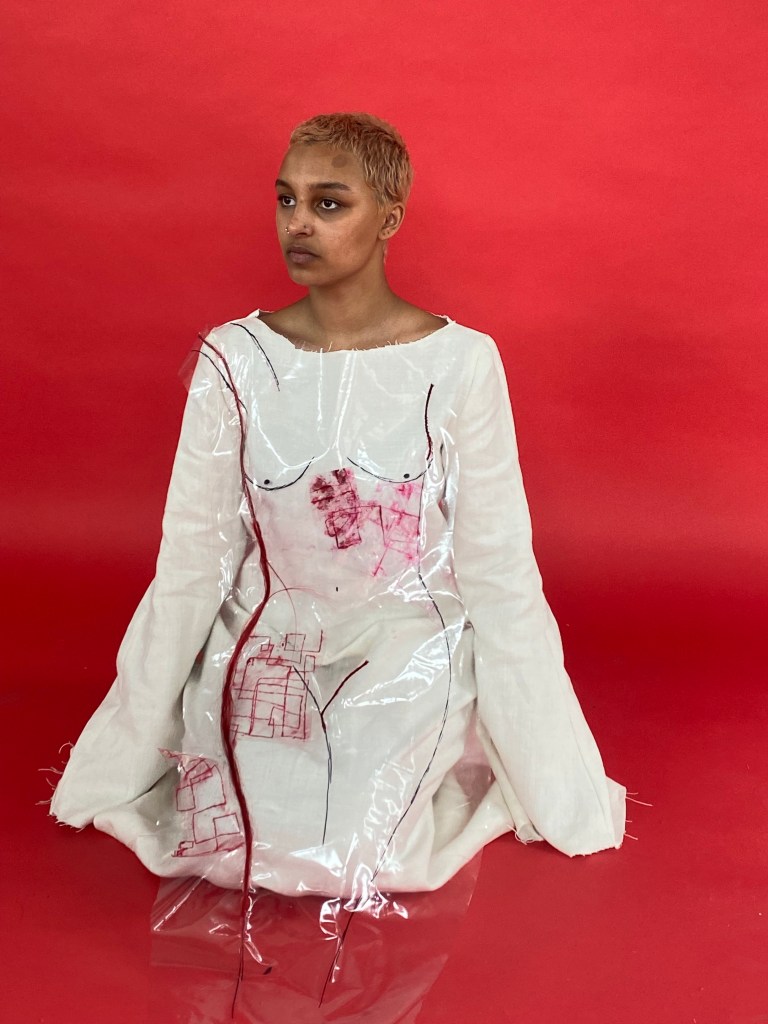
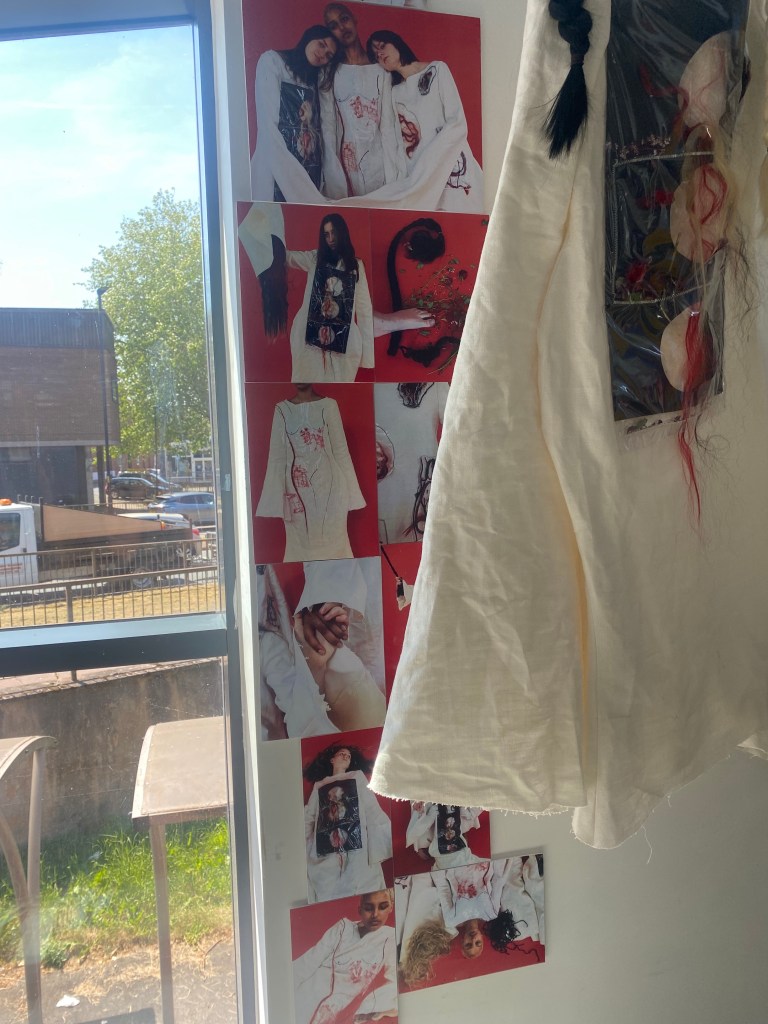
The fabric I will use for my final garments is an off white colour and is thicker than the calico. I chose this colour, as it represents purity but not full purity as it is not pure white which I believe is significant as women do not have to be pure in order to be accepted. Also, I chose a thicker material because it will create a better structure as my garments are quite sculptural.
Though I am really fond of this fabric, it does take a long time to cut as it is so thick.
Fashion illustrations, samples and drawings I have created throughout the process to compose and inspire one of the final garments:
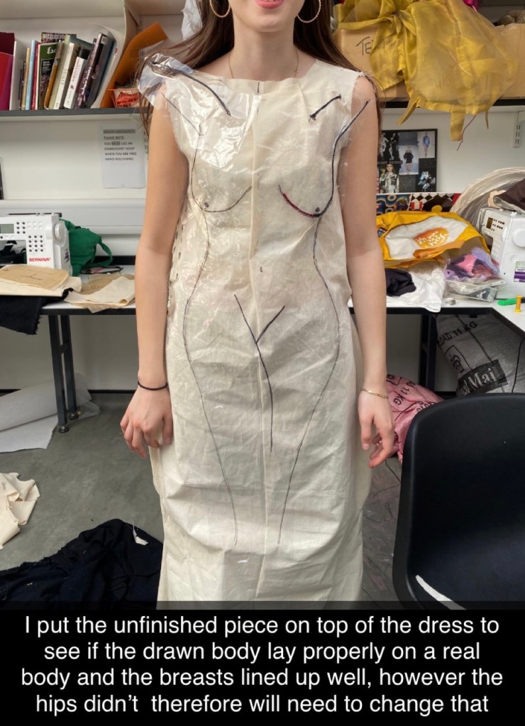
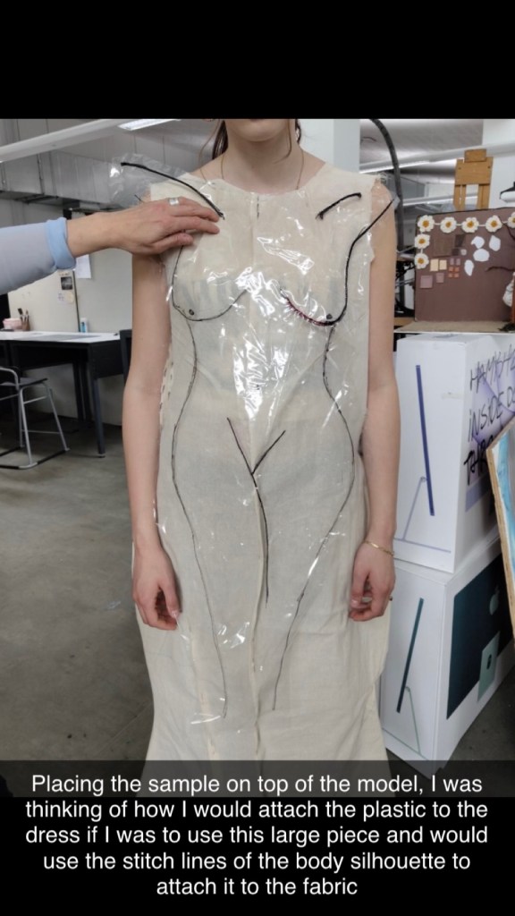
I placed the design in progress onto the model, to see the outcome so far and am happy with it as the drawn out form matches up to the real form.
Beginning to add to textile…
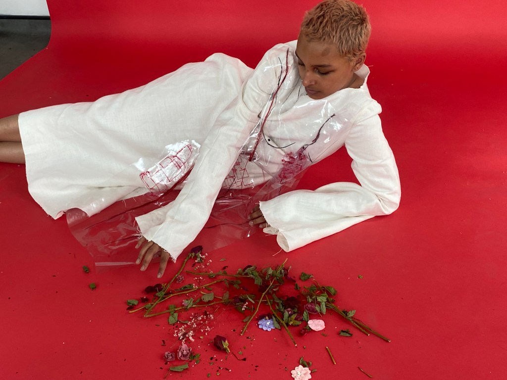
On the plastic, I used a slither of red hair to outline one of the hips on the body, and concluded that it looked more effective and professional by not using too much. To apply this, I used a hot glue gun.
Also, I added the unfolding house sample in various parts on the body, as it is not only a nice pattern but is a recurring symbol in my project and one of the concepts that I believe defines my idea. It is a symbol of hope, protest and unacceptance of control. Additionally, it must be noted that I didn’t use too much of this print either, for the same reason as previously.
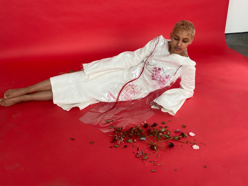
(left): the final outcome of this design – I am highly satisfied with this creation as it perfectly demonstrates everything I and this concept stands for. It shows a reinvention of Louise Bourgeois’ “Femme Maison” and depicts that positive change has happened since her artwork, however there is still room for plenty more change. By using red, it ignites danger, threat and anger which I need to show in order to get this protest across to an audience.
The body was drawn onto the plastic using sharpie, which I was then going to use as a template to stitch onto, however, I like the rawness of the sketch and will leave it.
(right): I placed the design against the fabric I will use and am happy with how it appears.
Placing it against one of the models to see how it looks on a body for a final check before final fitting
I am immensely fond of the simplicity yet enchanting appearance of this design. It is controversial.
Creating the next garment:
Sample inspiration for next garment:
I chose to use these samples for the next garments and recreate it on a greater scale.
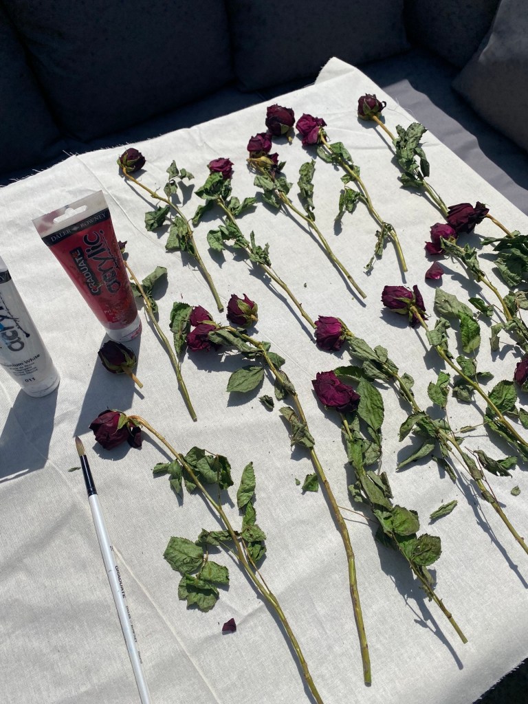
I dried flowers as in my other flower samples, the flowers quickly turned brown because I did not dry them beforehand:
Once the flowers were dried, they lost their colour and become more purple, which I didn’t want, as my colour theme is red. Therefore, I painted them red.
Sewing the final piece onto the garment:
Out of the making of the whole piece, this part was most challenging, as it was hard to sew the large scale design onto the fabric, as the card was stiff. Also, it must be noted that in this garment and the above, I sewed my designs onto the front of the dress, before stitching the dress together.
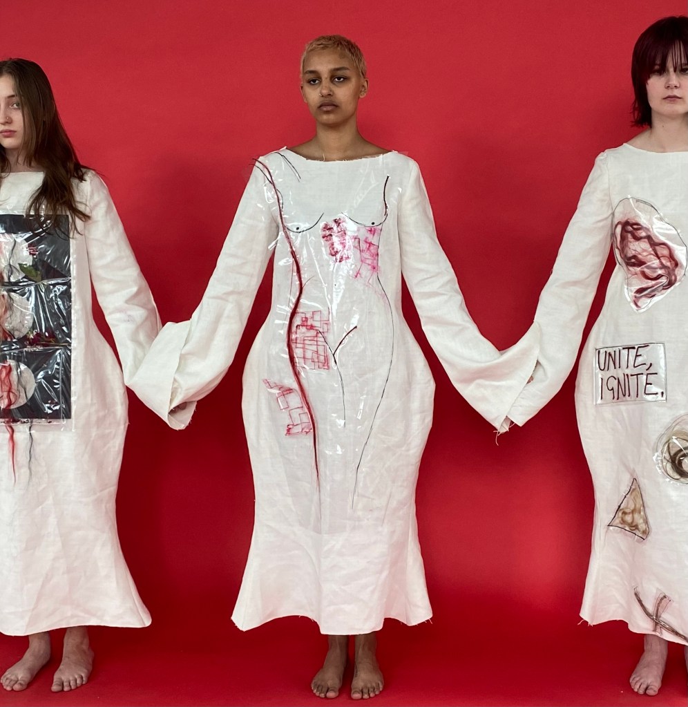
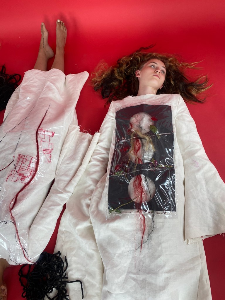
Overall, I am really pleased with the outcome of this garment, as it shows the connection of women through the weaving of the hair. I used zig zag stitch to reiterate anger, flowers to represent nature (taken inspiration from Ana Mendieta) and trapped the design in plastic as it is vital that I use a transparent material in each of these garments to show how it is necessary for women to be transparent to one another in order to overcome injustice. Also, it is effective that there is three circles, as there are three garments and three women – it story tells their connection. Aesthetically, it is effective that I used a softer shape such as a circle, as in the other garment, I used sharp, geometric lines, therefore it creates a contrast.
Creating the third and final garment:
For this final garment, I went a little off track and began to create a whole new design. However, this was positive.
The creations I stitched onto front pattern before sewing up:
Three flowers, three garments and three women – connection
A metaphor for the fact that they are hugged by their hair – it mythically protects them.
In my opinion, this sample is not only beautiful but also voices my project really well. However, I chose not to use it in my final design as it was too big, as for this one I wanted to use smaller, repetitive designs.
Soft shapes – a simple lock of hair
Multiple roses huddled together which represents union of women. For example, if I was to just use one rose, the creation would be a lot smaller, however, I used several and the scale was greater which acts as a metaphor for a greater force being created when women unite.
Contrast: a sharper shape – trinagle, again a simple lock of hair
I used different colours of hair throughout these garments to show diversity and how many different women there are in the world.
The second sample I used for this garment was inspired by this sample that I created at the very start of this project, consisting of acrylic splattered all over calico in thick texture. It represents an explosion, linking to my previous research of the gassing of schoolgirls in Iran. It is to suggest that though these despicable people are trying to kill women and girls, it only makes them stronger and is spat back in the oppressors faces as a feminine explosion is created through strength and resilience:
To create this, I got a piece of plastic, ends of paint tubes and created a thick texture using acrylic paint, then I folded the plastic and it created a blurred effect on the acrylic.. At first I did this to see how it looked, as I did not have time to wait for the acrylic to dry but was actually really happy with the appearance of it. Additionally, I used colours such as red, black, white and pink as they are the colours on my palette for this project. However, a colour tha I haven’t paid particular attention to until now is pink, and I used this as inspiration fashion designer, Lula Laora who creates a beautifully threatening woman using typically feminine things, in a strong and empowering way.
Also, to mention the fact that for this garment, the pattern had to be altered as the measurements for this model was different compared to the others.
After finishing the designs, I stitched them onto the dress.
I used samples from previously as they fit well with the others, for example, “UNITE, IGNITE.” and the female body.
I still need to attach the sleeves to the garments but I placed them onto mannequins and lined them up to see which arrangement worked best and this is the one I went for.
Extension of the sleeve:
In my illustration, the models on the end have the outer sleeves longer than the rest. Therefore, I extended the original sleeve for this on the cross and dot paper.
Here, I learnt how to attach a zip and found it tricky but accomplished it in the end. However, I didn’t have time to attach zips to all garments, therefore if I had more time this is something I would definitely change as it is more professional and technically challenging than using Velcro.
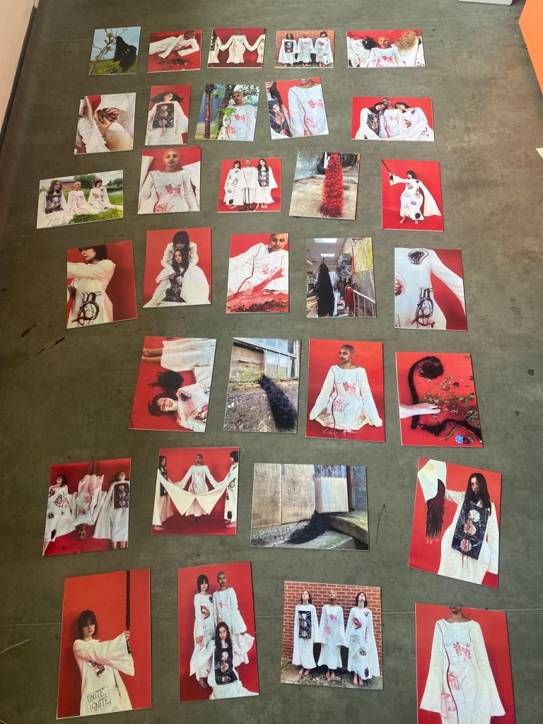
Photoshoot:
For this photoshoot, I wanted to create strength, power, unity and an eerie tone:
Photographs I didn’t use:
I liked the position of the sleeve in the first photograph but felt it weren’t the strongest. Especially as it was cut off from the backdrop.
The second photograph isn’t strong as the angle is awkward and the models don’t have strong facial expressions.
Though I really like the first photograph, I chose not to use it in my concluded images, as I had a similar one that was stronger.
Again, with the second photograph I chose to use a similar image instead of this one as this was not as strong. It doesn’t communicate as well as the other because we cannot fully see what is going on compared.
Though I liked the idea of these photographs and used one similar, I chose not to use these two, as it looks more moody, rather than powerful. Also, one of the models is closing her eyes in one of the photographs.
The first photograph is beautiful and perfectly illustrates togetherness and love within women. However, I didn’t like the fact they weren’t looking at the camera. Also, the arm in the bottom of the photograph ruins the picture.
In the first photograph, the composition doesn’t work. It looks odd, therefore I didn’t use it.
The next image is strong if cropped, however, there were others that were stronger therefore I ruled it out.
I didn’t use this photograph as I didn’t like how the model was looking down – they’re supposed to be strong and looking down represents loss of hope, insecurity, etc. Also, the other garment was cut off.
The second image is strong and I would’ve used it as I like the way she is stood and the way the garment is clearly represented. However, I chose others that focused on this particular dress and didn’t want the collection to be repetitive.
Again, these four photographs are very strong but I didn’t use them as I chose others similar.
I chose not to use any of these two photographs as I prefered a similar one that was a close up. They don’t represent the garment well.
In this image, the models are laying down but you cannot see all of them which I think is weak as it is about union of women.
In the first image, I really liked the joyful tone as the model is smiling/laughing. However, it didn’t fit the tone as the other photographs are quite serious and mature.
Second – I didn’t use this image as I took it as a screenshot out of the fashion film I created and decided to rule it out as I didn’t want to repeat the film onto images.
Though a beautiful shot and composition, I didn’t use this photograph as two of the models have their eyes closed.
Again, a beautiful and captivating shot, but I chose not to use it because as a collection, it didn’t fit in with the other photographs as they had a red backdrop. It stuck out, negatively.
Out of the two the second shot is strongest, however, they both didn’t fit with the theme of the red.
I like the position of the models on the first one and the silhouette they created. However, there is an imbalance of the sleeves which is massively important as they are a focal point.
The next one is strong and I do really like it, though I chose not to use it as it didn’t match with the rest of the chosen photographs but also because the models have slight smiles on their faces, and though I like that, it looked strange positioned against the rest.
Concluded photos:
I edited this photograph as I only wanted to see the red.
The way that they are connected by their sleeves through holding hands is a central concern in this project, and therefore needed to be used. They are one and therefore stronger.
This photograph was edited for the same reason as above.
For this shot, I pinned their sleeves together to show their connection and unity. Also, the fact that the sleeves are shown at their fullest here is significant as it really shows off the impact of the enlarged sleeves.
I edited this shot to be brighter, however chose to go with the original as it is more natural and fitted better as a collection with the other photographs.
Power screams in this shot – she is holding onto the plait like it is her weapon, or shield of some sort.
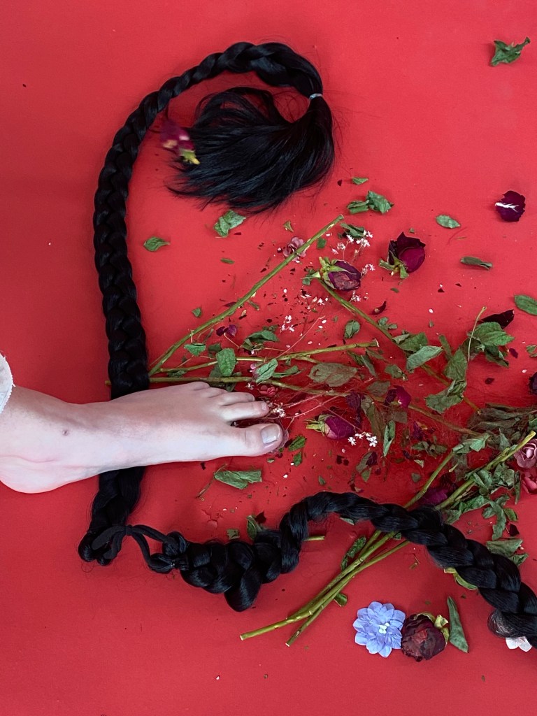
The first shot is a collection of a conclusion – hair, flowers and DNA. It is strange and captivating. Also, it is significant that I used a foot as a recurring sample in my process contained a footprint to represent women STANDING against injustice.
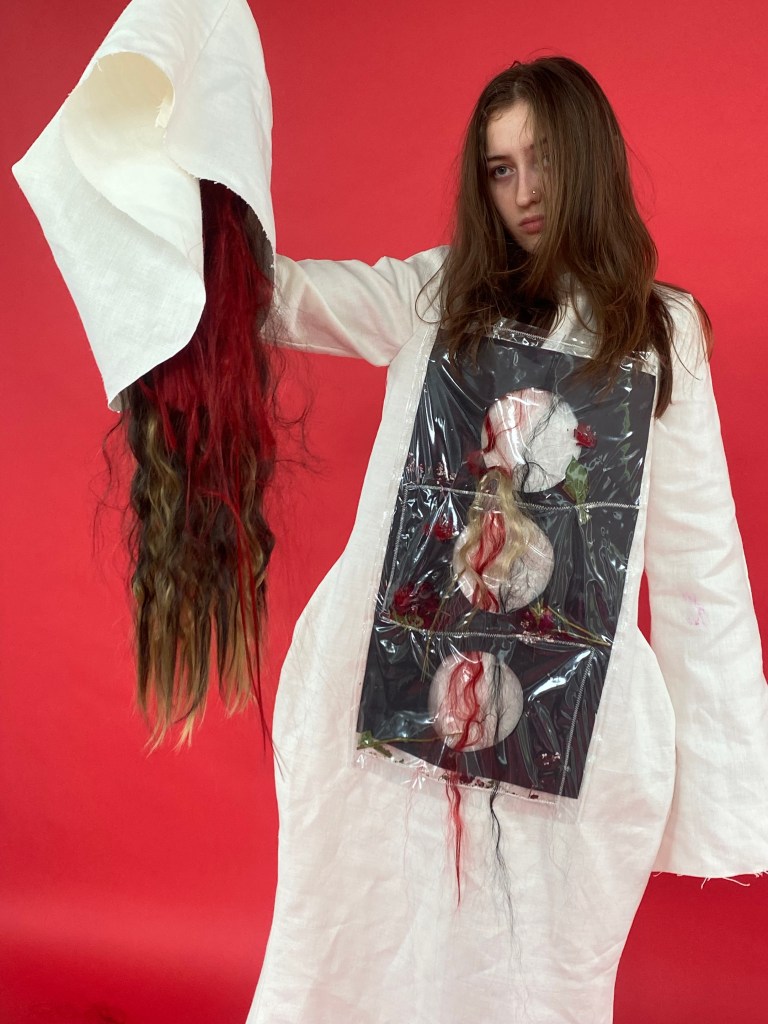
The second photograph is effective as the garment and design on it is clearly shown but also the hair coming out of the sleeve is effective. It is like fire pouncing out.
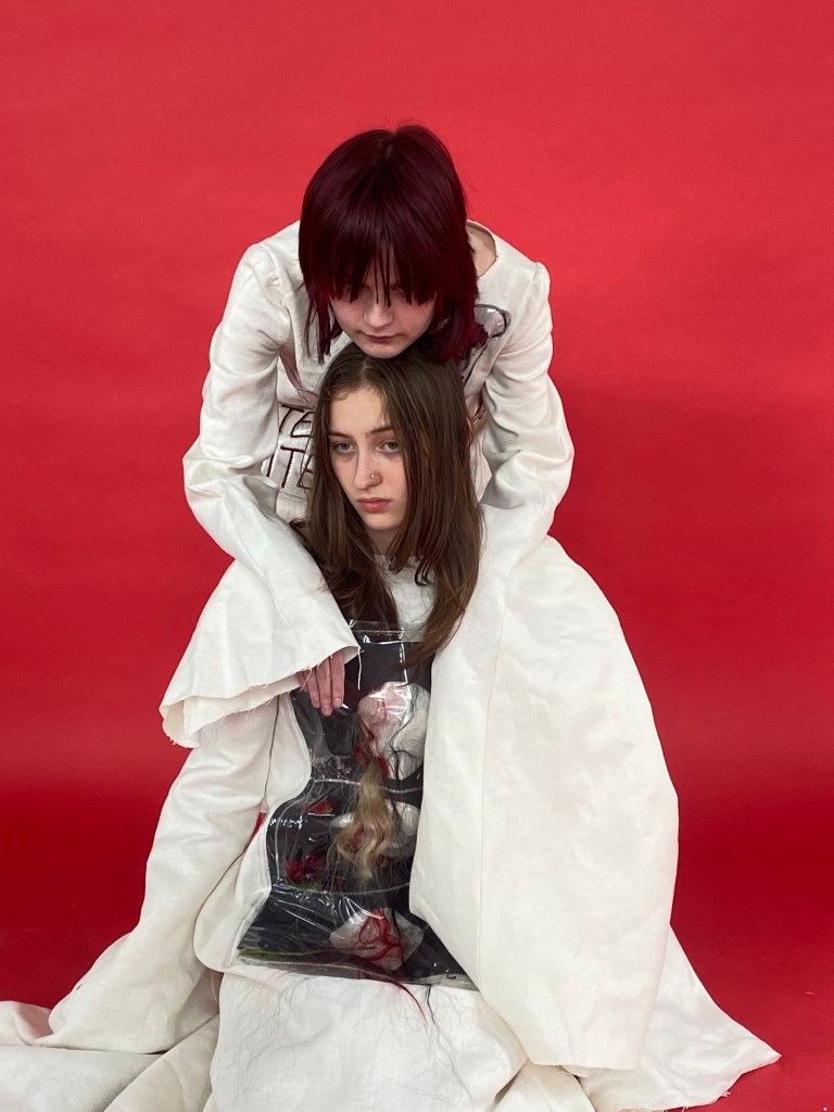
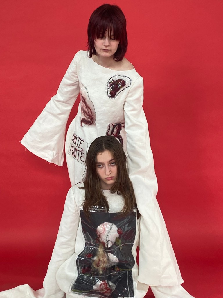
The first photograph is enchanting – the higher model is protecting the lower – they are a strong force that stand up and protect each other which is what I intended to recreate. Their heads positioned on each other also signifies this. The way that the lower model is looking at the camera is striking.
The second image doesn’t show garments or fashion but it does communicate loyalty and love. If we hold each other’s hands (metaphorically) change will happen. It represents peace, strength and community.
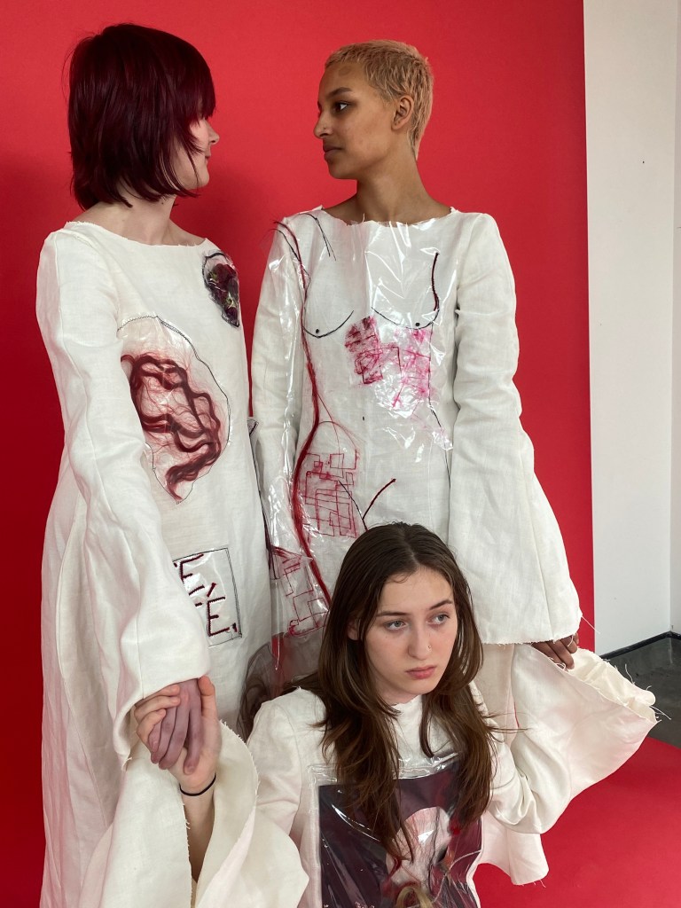
Though the models are all looking different ways I believe the first photograph is still strong as they are holding hands and they are a group – they are a protest. In all of these photographs, I like how they look at you to make you feel guilty, as we should feel guilty due to what is happening to women in Iran and all over the world. Their stares cut through your conscience. A story is created – the other two models are protecting her.
The next photograph is fascinating – it is deliberate, raw and natural. It is a clear, simple but effective representation of the garment. For this one, it is effective that her face is cut off as it provides a photograph only central to the garment.
I chose the first image as it looks ethereal and dreamy – she is looking down at flowers and hair whilst lay tranquilly. Also, I like the way the plastic design is displayed as it is another person lay with her.
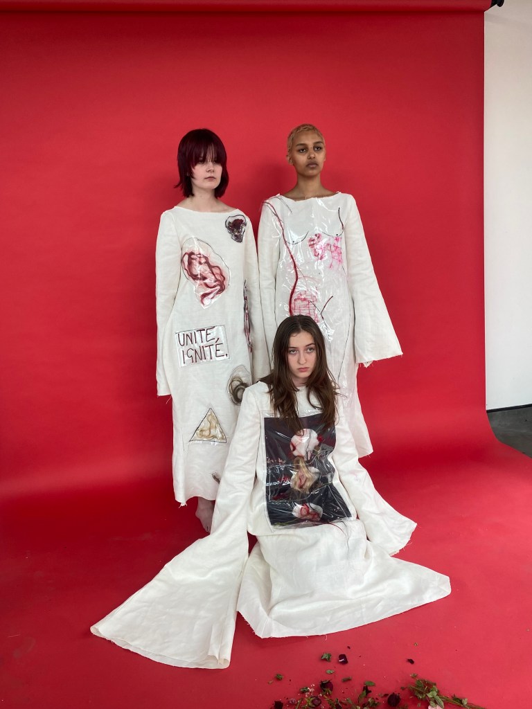
The next photograph is the strongest in my opinion – everything about it is perfection. The composition – angles they are stood at, provoking facial expressions, layout of the garments, hair coming out of sleeves, the triangle shape created, etc. They look like dolls but still strong at the same time. Also, the hair coming out of the sleeves is impactful as all the braids were connected which depicts them as a connected greater force.
The first photograph is impacting, as it feels as the model’s stare is intimidating. Also, I like the close up of the garment and how it isn’t the full garment. It is scary.
The next photograph is similar to the previous one except is a longer shot and the model has hair at the sides of her. It is strange and unusual, in a positive way. Additionally, the fact that hair is deliberately and unapologetically displayed is in protest against hijab laws in Iran – “we will show our hair if we want to!” This layout also makes the oppressors look stupid and pathetic as when you lay it out, we can see it is just hair. Yet, it scares them. I decided to use dreadlocks and blonde hair to show diversity. Also, I believe it to be significant that the model has a shaved head, as it relates to women shaving their heads in Iran. Another aspect that I love about this image is the fact that it is taken above the model.
Though these photographs have a different backdrop to the others, I believe they still look good against each other. Therefore, I used both.
The first photograph shows the models standing together, looking up for hope. They won’t give up. Also, the fact that the setting of this photograph is outside depicts that they protest and fight for what is right anywhere.
Again, the second photograph shows them all together and displays their garments beautifully, but also their facial expressions play part in this image. They are serious and will not be moved.
Again, an unusual and eerie piece – they are lay down and are together, protecting one another. I also like this image because it is different to the rest.
I cropped the image to zoom in more on the models and garments but also to crop the cut off of the backdrop off.
Another calming piece – I added hair behind this models head to make her hair look bigger and more central. This photograph also displays the garment well.
It must be noted I cropped this image to focus on this model only.
In addition, this image and the one above are arguably more vulnerable than others but I think it still works to show different emotions and atmospheres, as long as the central one is power and strength.
Overall, I am greatly satisfied with the photoshoot – a story is told of anger, passion and strength but then also peace, nature, tranquillity and vulnerability, at times. The aesthetics are unusual, scary and dreamy. Each photograph perfectly displays emotions of union, resilience, rawness and the protest against the treatment of women in Iran and women all over the world.
Fashion Film Inspiration:
Take inspiration from: natural surroundings, peace, ethereal, holding hands, diversity and movement
Don’t take inspiration from: overly happy, soft, colour scheme
My Fashion Film:
This is the first draft of my film and I am happy with the outcome, I used sound effects of thunder, long shots, close ups and also reversed the audio in the background to make it sound eerie.
In the final film, I edited the video at 0:33 out as it isn’t very strong as there is a lot of flapping of the sleeve which looks weak.
Another aspect I altered in the final was that I added a close up of the garment with the text, “UNITE, IGNITE.” stitched onto it.
In conclusion, I am highly satisfied with this short film as it communicates power, movement and resilience which are all the themes I wished to imply.
For the exhibition, I plan to have this film playing on a loop on a mac.
Audience:
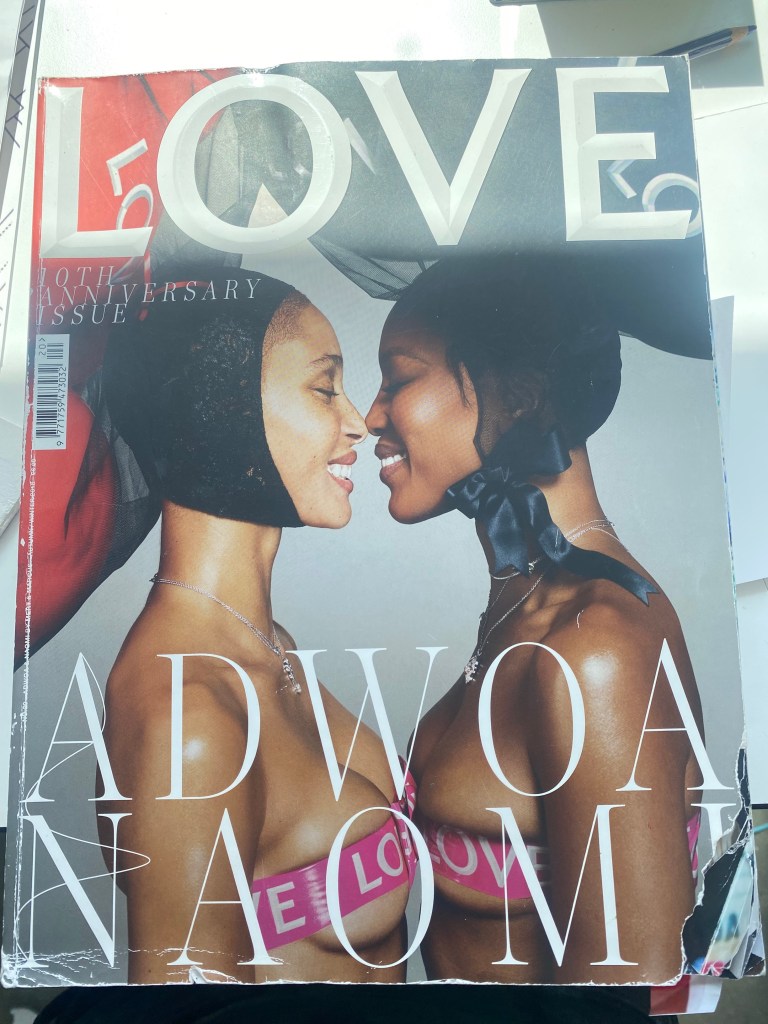
The audience that I am trying to reach in this work is everybody – every single person in society should know about the injustices all over the world against women and be active too do something about it. However, a main audience of mine is women and young girls – to know that they are accepted and loved even when cruel oppressors contain so much hatred. I want my campaign to be seen publicly to communicate the strength of women.
I envision my magazine to be in one such as “LOVE”, if it was to be:
Feminism
Political
Editorial
This magazine is controversial, thought provoking and unusual which relates to my garments and shoot.
Display for exhibition:
(illustrations/plan for display is in sketchbook).
To begin the construction of my display for the exhibition, I edited, rescaled and mounted the photographs, and I also mounted some that I ruled out just in case:
I came to the conclusion to have some roughly A3 down one side of the wall and more roughly A4 down the other side.
To construct this instillation, I cut through the seams of the shoulders of the garments and pinned the plaits to the two dresses. Then, my tutor helped me hang the garments by fishing wire:
The middle garment was stapled to the wall.
I love the idea of them having their arms raised in the air, as if in protest and power (the sleeves were stapled together).
Also, the fact it looks like the dresses are floating is significant and impactful. They are garments come to life. As well, it must be noted that one of my key words was movement and I believe that this displays just that.
From this, I still need to alter shape and composition as some dresses are folded.
A negative of this display is how the boards cut off almost half of the display, however people will still be able to see walking past and at different angles but if I could change one thing it would be to move the boards.
To refine the display, I pinned and stapled parts of the garments so they are fully shown and presented to the best of their ability.
I also rejigged and added more photographs to the wall.
Rising up in protest
Central focus on the middle garment as it was in the middle for the shoot and is the strongest in my opinion.
The photographs down the side are slightly hidden but you can still see them to the side, therefore I don’t think it is that big of an issue as I was given a large space.
A few of the photographs do not line up and are on diagonals, etc. but I think that this just adds to the weirdness and uniqueness in these garments, something I learnt from the pop up shop.
The strongest photographs displayed
On the other side, I had A3 photographs and some A4, and at first I thought it looked odd that they were all different sizes but looking at it now I like the irregularity for the same reason as previously.
In a lot of my illustrations and for my photoshoot, I presented hair falling out of sleeves like fire, or sound out of a trumpet. Therefore I wanted to display this. However, on the left, the hair is covering the photographs and photographs are covered already despite the hair, therefore I decided to take the blonde out and see what it would look like with just the red, though it may create an imbalance:
(sketchbooks and process in corner – won’t be seen in exhibition).
By doing this, I am happy with just the red hair and think it adds even more life and character to the outcome.
Artist statement to go with display:
Not only does hair clearly identify female DNA from male, historically it is a place where women join together and bond in the action of grooming, unity and support . Focusing on recent news headlines, women in Iran are forced to cover their hair, or risk imprisonment, or worse. Therefore, women are coming together in protest against this. I used hair as a medium to represent power, strength and a beautifully threatening union of women. When women unite and protect one another, a greater force is created…
Main artists I have taken inspiration from throughout this project:
Small evaluation:
Overall, I am really happy with the outcome of the display and the end of my final project in general. Each garment is composed of hair, natural materials and stitch which relates back to my research of the treatment of women in Iran and the significance of hair. Here, I have taken the material of hair and used it as a medium to protest against control over women, almost as a superpower quality to be used against injustice. From artists such as Louise Bourgeois, Ana Mendieta, Sarah Maple and Alice Anderson I believe that my inspiration taken from them can be found in this through female form, the colour of red, anger, feminism, natural materials and much more. These three garments are a symbol for joy yet anger, dreamy yet erratic and beauty yet unusualness. Each one is full of life, just like women.
End of Unit Evaluation:
Context:
I chose to focus on unity of women by linking it to hair as women in Iran are forced to cover their hair – the reason I chose this subject was because it is despicable that women in the 21st century are controlled. I feel a burning passion to protest this and the anger that women feel. The fact that female inequality has been an ongoing issue for centuries and is still unjustifiably relevant to this day, change needs to happen. Another reason I chose this theme is because a lot of my art contains projected anger, and I felt angry about this topic when I heard it on the news therefore concluded that this would be the best subject to develop into art.
In my research of this, I have investigated horrifying news articles of cruel things that have happened to women, and unfortunately but fortunately learnt how cruel people can be, compared to before my research. In the composition and making of my design, I have learnt that less is more, as I tend to add too much to a piece and overcomplicate it – however, here, I have altered this. In the beginning of this project, I wanted to show fragility of women but also strength. However, I decided that I only want to show strength. Another concept that has changed in my original intention was that I was only going to create one garment along with a photoshoot. However, I made three garments and created a fashion film.
Research:
In the research and experiment process of my outcome, I learnt many different textile techniques including slashing, monoprint, boning, trapping etc., which supported my understanding of my project as each sample delivered a metaphor for my subject.
Artists and designers such as Louise Bourgeois, Lula Laora and Ana Mendieta have influenced me as they each generate raw emotion, use natural resources, and depict a beautifully threatening woman which was key to my outcome.
Culturally, I have investigated the culture of Iran and how women lack equality compared to men. Not only are they forced to cover their hair, but there are also crimes that go against women and remain without consequence given to the criminal which is revolting. On a lighter note, I also did a lot of research into hair – culturally, historically, and scientifically which was very interesting.
Relating to sustainability, I have used zero waste fabric and used scrap material wherever possible. Additionally, a lot of paper used for the process was also scrap, and I used natural materials such as flowers and twigs instead of man-made.
Development of creative practice:
Drawing has supported my creative development, as it has helped me to communicate ideas through symbols when words cannot. An aspect that drawing has supported me with was when looking at Louise Bourgeois’ “Femme Maison”, that depicts female form and a house to represent how women are seen as household objects, I decided to recreate this in an empowering way. I drew an “unfolding house”, an abstract approach that even developed to being in one of my final garments.
Illustrations of initial designs led me to my final design. For example, I took a piece of black card, cut out three circles and wove straw through it. However, this then developed to using hair instead, adding flowers and stitch and trapping it in plastic to depict how transparency is vital within women. This simple sample that used hair to metaphorically represent how women will not hide and will find ways to get through to freedom, became a large piece onto one of my final garments, which I find interesting – how something so small and dismissive can become something greater and impactful – which also coincides with this project.
The biggest skill I have learnt is pattern cutting and improvement on my sewing, which I struggled with before. I managed to sew three garments which I wouldn’t have been able to achieve before this project. Another challenge of mine was remembering technicality when producing a garment – where to sew and altering a pattern, however I did overcome this.
Problem Solving:
To progress in Fashion, I have made and illustrated wearable garments, as in past briefs, I have created “wearable” fine art sculptures. Therefore, I wanted to challenge myself in creating something more technical. I struggled and got frustrated with the making of a more technical piece, but after making mistakes I accomplished the challenge and created three garments.
When something has gone wrong, such as cutting a pattern wrong or editing on photoshop, printing, etc., I have not given up and don’t stop until my desired concept is made. Or, if the issue was taking too long to resolve I would come back to it and get on with another task in the meantime, rather than do nothing.
A theory that I have mainly used in my final design is the silhouette of a garment – I have considered female form and therefore structured the dress to have curves and elongated the sleeves to look abstract and unusual as the piece aesthetically made a statement, which my concept needed, being political. Also, the garments were bespoke as I cut patterns and measurements to individually fit them. There was no great aspect of my work that remained unresolved, however I only added one zip to one of the dresses, whereas I planned to add them to all three – the other two consist of Velcro, therefore if I had more time, I would have added the zips to the other two as it is more professional and technically challenging.
Planning and Production:
On my proposal, I have followed my timetable as well as I could, however a few changes were made. For example, I started making my garments later than I intended, however, I believe that this was a successful change as it generated the greatest outcome having more research and initial designs, and I still managed to get my idea done in the time given. Another concept that has helped with time management is creating a more in depth timetable every day, as things do change. Overall, I believe that planning is one of the aspects that create a successful outcome, though I didn’t follow it step for step, it was a guide that absolutely helped. I also made sure not to over plan as I didn’t want it to create an imbalance of my creativity.
I believe that I haven’t been under nor over ambitious in my project, as I am highly satisfied with the conclusion of three garments, a short fashion film and a photoshoot. However, if I had more time, I would have created two more final garments as I made three to represent unity and protest, whereas five would have emphasised this even more so.
Evaluation and Reflection:
To start of the project, I researched into a lot of articles, different types of art (fine art, fashion, etc.) and some poetry/books/films and continued this process throughout the whole way. Therefore, this enabled ideas and concepts to change in a positive way. Through this research it enabled decision making and evaluation. At least once a week I would reflect and critically analyse the work produced, however, at times I would get consumed by the making that I would forget/not have time to reflect onto the blog and in general, which I believe is a negative of my process and something I want to improve on.
A method I find useful when critically analysing and reflecting is creating quick mind maps, as these short ideas can spark great and larger concepts/ideas. Another method I find useful is asking for another person’s opinion, as theirs may be different to yours which can be effective, for example, I tend to add too much to a piece, therefore another person’s opinion does and has helped with this project. When I first started my final project, I wanted to learn new sewing techniques, and I believe that I have effectively displayed this as I have critically analysed this on my blog through process of making and materials used.
Communicating and Presenting a Creative Practice:
Presenting my initial ideas through the Pechakucha helped to form my proposal, as feedback from tutors and students was effective, as I was stuck on which idea to choose.
Overall, crits have been vital for the progress in work as I tend to have a layout of ideas but struggle to conclude, which is something that crits have helped me improve on, without discarding my personal ideas.
Numerous techniques and methods have been used to communicate my creative journey to an audience. For example, I have used my sketchbook as an all in one of sketches, collages, planner, research file, etc. as having it all in one place is easily accessible. My blog has been a great device for this. Another method I use is the notes app on my phone, as it is simple and won’t get lost like a piece of paper could.
To present my final outcomes, I have edited photographs from my photoshoot, printed them off and mounted them onto boards, displayed them on either side of my wall. Centrally, I wanted the garments to be displayed and had them hung by hair, and pinned which I believe is creative. Also, I have displayed my fashion film on a mac for the exhibition. Moreover, the layout relates to my practice, as I hung the garments by HAIR which has been a central focus in my project. Additionally, the fact that sleeves of the garments are in the air represents protest and movement, key themes within my project.